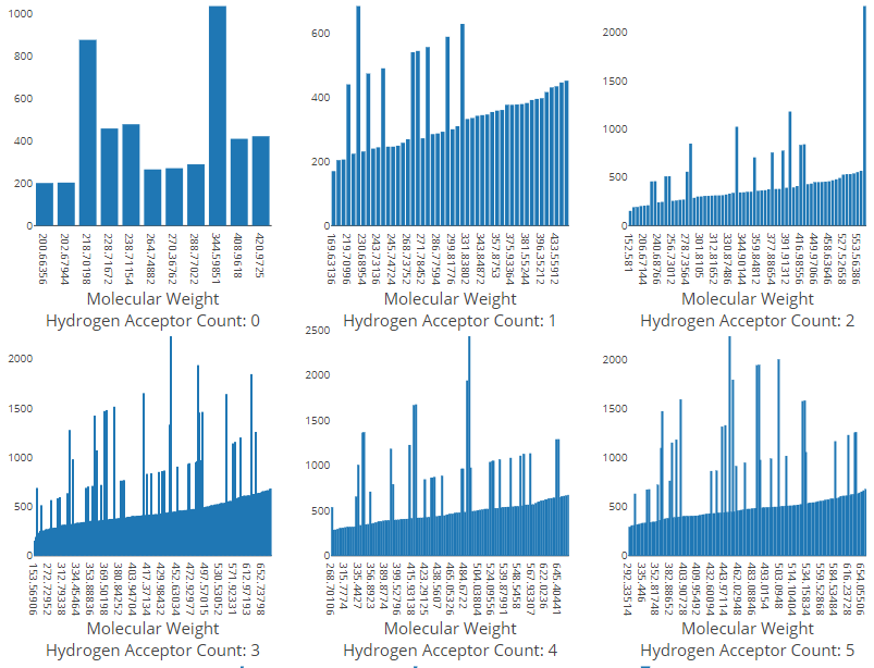
Group By Property
You can compare your data in multiple smaller charts arranged next to each other. This arrangement is also known as a small multiple, trellis chart, lattice chart, grid chart, and panel chart.
You can define the Group By property to create one chart for each unique value of the property. The system prevents you from using properties that do not allow this type of data grouping.
Each chart uses the same x and y properties, and displays a label indicating its unique group value.
The app automatically arranges the charts up to 3 per row in the tool in the Analysis view. If there are more than 3 charts created, you can scroll to view the additional charts. Charts created from a null or empty value appear at the end of the arrangement regardless of the sort order in the tool.