| Dialog Type
|
The options available in the
section let you select the interactions between the end-user and the dialog.
|
|
|
Use buttons
|
Lets you use buttons.
|
|
|
Use a combo box
|
Lets you enter information in a combo box.
|
|
|
Use an input field
|
Lets you enter information in an input field.
|
| Properties
|
This section lets you set
the dialog properties.
|
|
|
Message
|
Lets you enter the message to be displayed at runtime.
|
|
|
Picture name (must be in associated
AppRes)
|
Lets you enter the name of the picture displayed in the
dialog. Enter the full picture name (including the extension) as stored in the
Know-how component resources folder.
|
|
|
Choices (separated by comma)
|
- If you selected
Use buttons or
Use a combo box, enter the button
names or the combo box lines.
- If you leave the
box empty, a
Continue button is available in the
dialog to close it and get back to the process.
|
|
|
Editable parameter
|
If you select
Use an input field, select in the
tree,
the parameter valuated by the end-user after clicking
Continue.
|
|
|
Come back to the process App after the end of
this behavior
|
Select this option to get back to the original
app
process.
|
|
|
Note:
The options of the
Properties section have corresponding
parameters in the
tree:
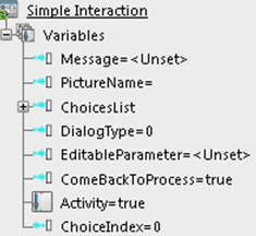
|
- Choices option: the comma separated
values are converted into a list of strings named
ChoicesList.
- The
output attribute
ChoiceIndex returns an integer
value that matches the index of the user choice in
ChoicesList.
|
|
 .
.