Graph View

You can use this visualization to show objects with their linked objects. When users select a node, a small modal window opens to let them expand, see details, and see a more information panel.

This task shows you how to:

Define the Data to Show

  1. In the Properties panel, go to Data.
  2. Select a data query and a Result Set.

Define the Chart Title and Icon
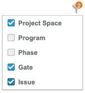
  1. In the Properties panel, go to Style.
  2. Specify the chart title.

    Note: To localize this title in other languages, click , and select a translation key. You define keys and translation values in the Translation menu.

  3. Select the icon that represents your chart.

Define the Nodes to Show on the UI

Before you begin: For this visualization, one result set in the Data > Result set section.
  1. In the Properties panel, go to Data.
  2. In the Data sections, configure the display of root nodes and related nodes.
    OptionDescription
    Target Studio variable Specify the variable that the visualization uses to create the first node.
    Node identifier Select the field to use as node identifier.
    Node Content Select the field to use for the node content. The filter menu shows the values of this field.

    Node Label Select the field to use as node label.
    Color for Nodes Associate fields with colors either automatically through the Palette option or manually.
    Maximum Nodes Limit Specify the maximum number of related nodes to show when you select or 
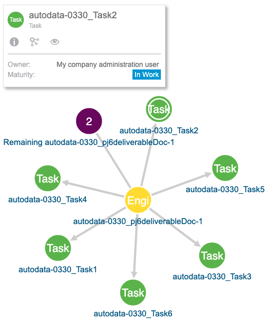
expand a node. When the number of related nodes exceeds this limit, the related node indicates the number of remaining nodes.
    More Information Panel Specify the fields to show in the Details panel when you click .

Define the Value Colors

You can define the colors to apply on nodes depending on the values of a selected field.

  1. In the Properties panel, go to Data.
  2. In the Colors section, select the colors to apply to the field values.
    OptionDescription
    Color

    This is the default color associated with all field values.

    Palette

    Associates field values to colors automatically.

    There is a limit in the number of colors available. Data Perspective Studio reuses the same colors when the number of values crosses this limit.

    Important: The Palette colors are common to all visualizations in your app for consistency.
    Customize

    You can search for values and customize their colors.

    There is a limit to this customization, which blocks the option when there are more than 100 values.

    Important: The colors in Customize apply to the current visualization only.
    Additional mapping

    You can define conditions to apply colors, by defining a Comparator and an associated Value.

    For example, you can define to associate a color when the value is inferior (<) to the expected value.

    matches: allows you to specify a regular expression to choose the color or the icon to apply, depending on the value for the selected field.

    Note: There are priorities if you define several colors for the same field value. Manual customizations first, then colors defined for additional mapping, and at last, the default color.

Add On-click Actions

You can specify actions to show in the details panel of the Graph view visualization. These actions display next to the and icons (see the icon in the previous screenshot).

  1. In the Properties panel, go to Actions.
  2. Click to add a new effect.
  3. Select the effect Behavior.
    OptionDescription
    FilterFilters screen data with the content dropped on the screen.

    Information source: Specify the field to filter data.

    Target studio variable: Select the data query variable to store source data.

    Set variableSpecify the variable that stores the data.

    Target studio variable: Select the data query variable where Data Perspective Studio stores source data.

    Navigate to screenSelect the destination screen to open when you click an object.

    Target screen: The destination screen where the user goes after clicking an object. For example, for a visualization showing risks, clicking a risk could redirect the user to a details page.

Add a Drag Button in the Detail Panel

You can add a drag button in the detail panel for users to drop objects in another 3DEXPERIENCE platform widget.

  1. Select Add drag button in the detail panel.
  2. For 3DEXPERIENCE Service, select the variable, which contains the id of the 3DEXPERIENCE Service from which the data comes. By default, it uses 3DSpace.