History Timeline

You can use this visualization to show a timeline of events or changes on a specific hit. You can use it to show the history of modifications made on an object in a chronological order.

This task shows you how to:

Define the Data to Show

  1. In the Properties panel, go to Data.
  2. Select a data query and a Result Set.

Define the Chart Title and Icon

  1. In the Properties panel, go to Style.
  2. Specify the chart title.

    Note: To localize this title in other languages, click , and select a translation key. You define keys and translation values in the Translation menu.

  3. Select the icon that represents your chart.

Define the Fields to Show on the UI

  1. In the Properties panel, go to Data.
  2. In the Display Fields section, select the fields to use and the icons that must represent them.

    Note: For Date, you must associate a field that has a date format to get a relevant display.

Define the Value Colors

You can define the colors to apply on icons depending on the values of a selected field.
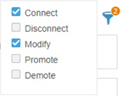
  1. In the Properties panel, go to Data.
  2. In the Colors section, select the colors to apply to the field values.
    OptionDescription
    Color

    This is the default color associated with all field values.

    Palette

    Associates field values to colors automatically.

    There is a limit in the number of colors available. Data Perspective Studio reuses the same colors when the number of values crosses this limit.

    Important: The Palette colors are common to all visualizations in your app for consistency.
    Customize

    You can search for values and customize their colors.

    There is a limit to this customization, which blocks the option when there are more than 100 values.

    Important: The colors in Customize apply to the current visualization only.
    Additional mapping

    You can define conditions to apply colors, by defining a Comparator and an associated Value.

    For example, you can define to associate a color when the value is inferior (<) to the expected value.

    matches: allows you to specify a regular expression to choose the color or the icon to apply, depending on the value for the selected field.

    Note: There are priorities if you define several colors for the same field value. Manual customizations first, then colors defined for additional mapping, and at last, the default color.

Define the Filters to Show on the UI

You can configure the filters available on the UI, when the users clicks on the upper right of the visualization. To do so, you specify the set of dimensions that users can select as filters.

  1. In the Properties panel, go to Data.
  2. In the Filters section, click .
  3. If you switch From result set:
    • On - Data Perspective Studio retrieves the dimensions defined on the result set specified in the Result set section. From Dimension reference, you can then select the dimension to add for the filtering.
    • Off - Select the field to use as filtering dimension.
  4. From Label, enter the filter label.

    Optionally, click if you want to localize the label in other languages.

    These filters display when you click on the upper right of the visualization.

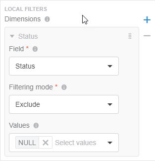
Reduce the Scope of Dimensions with Local Filters

For a visualization that displays data for a dimension (for example, in a chart axis), it may be useful to focus on specific values for that dimension. You can do so using a local (internal) filter.

For example, if you have a priority dimension that contains Very Minor, Minor, Major, and Critical priorities, you may want to display values for the Major and Critical priorities only.

Important: Unlike Filters, you cannot select Local Filters on the visualization UI.

  1. In the Properties panel, go to Data.
  2. In the Local Filters section, specify the dimensions for which you want to filter data out as follows:
    1. From Field, select the dimension on which you want to apply the filtering.
    2. From Filtering mode, select Include or Exclude.
    3. From Values, select the set of values to include or exclude from the dimension.

    For example, for the Status dimension, you can exclude NULL values.