Define the Data to Show
-
In the Properties panel, go to
 Data.
Data.
-
Select a data query and a Result Set.
Define the Measure
You can configure the measure to show in the visualization. By default, Data Perspective Studio suggest the measures available in the data query result set.
-
In the Properties panel, go to
 Data.
Data.
-
Select a Measure.
Data Perspective Studio lists the numerical fields, and the aggregation functions defined in the data query.
The default aggregation is COUNT.
- Optional:
Click More options to open advanced configuration properties.
For example, you can select a currency format like USD.
-
In Category name, enter the name to show on the UI.
Note:
To localize this title in other languages, click  , and select
a translation key. You define keys and translation values in the
Translation menu. , and select
a translation key. You define keys and translation values in the
Translation menu.
Enable History Chart & Trend
Reduce the Scope of Dimensions with Local Filters
For a visualization that displays data for a dimension (for example, in a chart axis), it may be useful to focus on specific values for that dimension. You can do so using a local (internal) filter.
For example, if you have a priority dimension that contains Very
Minor, Minor,
Major, and
Critical priorities, you may want
to display values for the Major
and Critical priorities only.
-
In the Properties panel, go to
 Data.
Data.
-
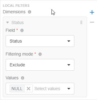
In the Local Filters section, specify the
dimensions for which you want to filter data out as follows:
-
From Field, select the dimension on
which you want to apply the filtering.
-
From Filtering mode, select
Include or
Exclude.
-
From Values, select the set of values to
include or exclude from the dimension.
For example, for the Status dimension, you can
exclude
NULL values.

Show Underlying Data in a Data Panel
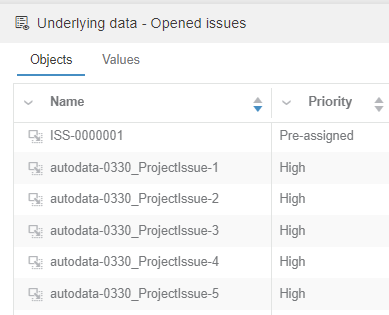
You can add a Show underlying data action in the  Actions menu of most charts. On-click, Data Viewers can see more information about chart data in a data panel at the bottom of the page. Actions menu of most charts. On-click, Data Viewers can see more information about chart data in a data panel at the bottom of the page.
- In the Properties panel, go to
 Data. Data. - In the Data Panel section, select Enable Data Panel.
- From Fields, add the fields that you want to see as table columns in the data panel.
- Optional: Select Allow to reorder columns if you want Data Viewers to be able to reorder columns by dragging their headers.
- Optional:
From Buttons, define the icons (and their on-click effects)
to show in an Actions column.
- Optional: Select Add drag button in the first column to add a drag icon
 in that column for users to drop objects in another 3DEXPERIENCE platform widget. in that column for users to drop objects in another 3DEXPERIENCE platform widget.- In Information source, select the field to use as data source.
- In Object type, specify the name of the object to drag.
-
For 3DEXPERIENCE Service, select the variable which
contains the id of the 3DEXPERIENCE platform service. For example, 3DSpace.
- Optional:
Select Add "Open with" in the actions column to add a button
allowing Data Viewers to open an object in another 3DEXPERIENCE platform app. For example, 3D Markup, CATIA V5,
Product Explorer, or Product Structure Editor.
- Optional:
Enter the Label to show on the Open
with button.
-
In Icon, specify the button icon.
- Optional:
You can also add a tooltip and a theme.
- Optional:
From Effects (On checkbox click), you can define an
interaction with a 3D Widget outside of your Data Perspective app to select a part.
When the Data Viewer clicks a 3D object in the data panel, the 3D Widget refreshes to
show corresponding data.
Note:
To do the opposite, that is, click an object in a 3D Widget and refresh the Data
Perspective view, use Effects (On 3D Selection).
- Optional:
From Effects (On 3D Selection), you can define how the data
panel reacts, when the Data Viewer clicks a 3D object in a 3D Widget outside of your
Data Perspective app. The Data panel refreshes to show the data selected in the 3D
Widget.

Define Colors
-
In the Properties panel, go to
 Style.
-
For Background color, select the color to apply in the
visualization background.
-
For Value color, select the color to apply on the KPI
figure.
Add Actions to the Actions Menu
You can add actions to the list of available  actions, in
the upper right of the visualization. actions, in
the upper right of the visualization.
Add a Target
You can add a target indicator to the chart to let users compare the KPI value with
the target value.
-
In the Properties panel, go to
 Targets.
-
Choose how to define the target value.
- Select Custom value, and specify a numerical
Value. For example, 5.
- Clear Custom value, and specify a Target
measure.
- Optional:
Click
 to add a
Conditional display. to add a
Conditional display.
-
For Type, select the condition comparator. For example,
select <= if you want the condition to apply only if the
field value is lower or equal to the Value.
-
For Color, select the color to apply when the value
matches the condition. For example, green.
-
For Icon, specify the icon to show when the value matches
the condition. For example, a cog.
-
Select Use for menu, to show additional menu actions
 when
the value matches the condition. when
the value matches the condition.
To add additional menu actions for reached targets, see Add Actions to the Actions Menu. Note:
When
the value matches the condition, an orange circle appears above the visualization
 actions, and the actions specific to reached targets.
-
Select Display goal, to show Target:
<value> below the KPI value.
|
 Data.
Data.