Define the Data to Show
-
In the Properties panel, go to
 Data.
Data.
-
Select a data query and a Result Set.
Switch to Another Type of Chart
You can switch from one type of polar chart to another in one click.
-
In the Properties panel, go to
Data.
-
In the Type section, click the icon corresponding to the type
of chart that you want to show.
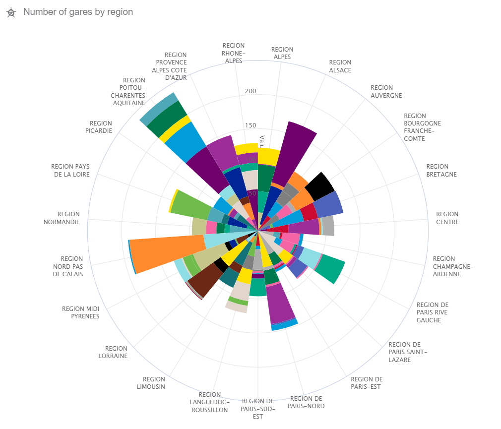
 Polar
line Polar
line
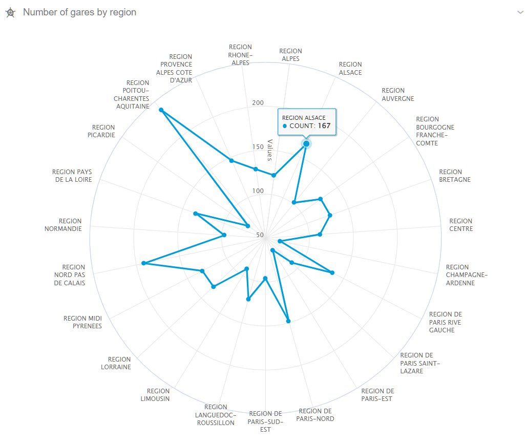
 Polar
bar Polar
bar
Define the Dimensions
You can configure a dimension by selecting a field. By default, Data Perspective Studio suggests the dimensions available in the result set.
-
In the Properties panel, go to
Data.
-
In the Sectors section, click
 to add a
Dimension. to add a
Dimension.
-
For Field, select the field to use as dimension.
- Optional:
Click More options to open advanced configuration
properties.
Define the Measures
You can configure the measures to show for the Y axis. When there are two
dimensions, Data Perspective Studio uses only the first measure.
-
In the Properties panel, go to
Data.
-
In the Values section, click to add a
Measure.
-
For Value, select the aggregation value to use in the Y axis.
- Optional:
Click More options to open advanced configuration
properties.
Define the Axes Options
You can define how to display the axes of your polar chart using several
parameters.
-
In the Properties panel, go to
Data.
-
In the Axes option section, define the field to use as
Title.
| Option | Description |
|---|
| Title |
Select the field to use as chart title. |
| Scale |
Select how to display the radius axis, that is, either with a linear or a
logarithmic scale. |
| Display as |
Select whether to display values or percentages on the axes. |
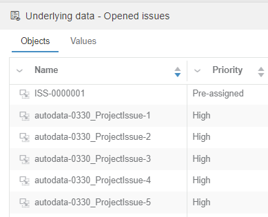
Show Underlying Data in a Data Panel
You can add a Show underlying data action in the  Actions menu of most charts. On-click, Data Viewers can see more information about chart data in a data panel at the bottom of the page. Actions menu of most charts. On-click, Data Viewers can see more information about chart data in a data panel at the bottom of the page.
- In the Properties panel, go to Data.
- In the Data Panel section, select Enable Data Panel.
- From Fields, add the fields that you want to see as table columns in the data panel.
- Optional: Select Allow to reorder columns if you want Data Viewers to be able to reorder columns by dragging their headers.
- Optional:
From Buttons, define the icons (and their on-click effects)
to show in an Actions column.
- Optional: Select Add drag button in the first column to add a drag icon
 in that column for users to drop objects in another 3DEXPERIENCE platform widget. in that column for users to drop objects in another 3DEXPERIENCE platform widget.- In Information source, select the field to use as data source.
- In Object type, specify the name of the object to drag.
-
For 3DEXPERIENCE Service, select the variable which
contains the id of the 3DEXPERIENCE platform service. For example, 3DSpace.
- Optional:
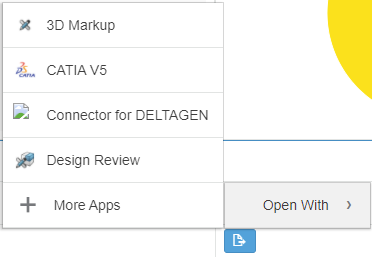
Select Add "Open with" in the actions column to add a button
allowing Data Viewers to open an object in another 3DEXPERIENCE platform app. For example, 3D Markup, CATIA V5,
Product Explorer, or Product Structure Editor.
- Optional:
Enter the Label to show on the Open
with button.
-
In Icon, specify the button icon.
- Optional:
You can also add a tooltip and a theme.
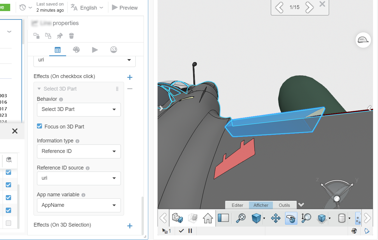
- Optional:
From Effects (On checkbox click), you can define an
interaction with a 3D Widget outside of your Data Perspective app to select a part.
When the Data Viewer clicks a 3D object in the data panel, the 3D Widget refreshes to
show corresponding data.
Note:
To do the opposite, that is, click an object in a 3D Widget and refresh the Data
Perspective view, use Effects (On 3D Selection).
- Optional:
From Effects (On 3D Selection), you can define how the data
panel reacts, when the Data Viewer clicks a 3D object in a 3D Widget outside of your
Data Perspective app. The Data panel refreshes to show the data selected in the 3D
Widget.
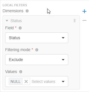
Reduce the Scope of Dimensions with Local Filters
For a visualization that displays data for a dimension (for example, in a chart axis), it may be useful to focus on specific values for that dimension. You can do so using a local (internal) filter.
For example, if you have a priority dimension that contains Very
Minor, Minor,
Major, and
Critical priorities, you may want
to display values for the Major
and Critical priorities only.
-
In the Properties panel, go to
Data.
-
In the Local Filters section, specify the
dimensions for which you want to filter data out as follows:
-
From Field, select the dimension on
which you want to apply the filtering.
-
From Filtering mode, select
Include or
Exclude.
-
From Values, select the set of values to
include or exclude from the dimension.
For example, for the Status dimension, you can
exclude
NULL values.
Define the Chart Title and Icon
-
In the Properties panel, go to
 Style.
-
Specify the chart title.
Note:
To localize this title in other languages, click  , and select
a translation key. You define keys and translation values in the
Translation menu. , and select
a translation key. You define keys and translation values in the
Translation menu.
-
Select the icon that represents your chart.
-
For Grid type, select to show the background grid in
Circle or Polygon.
Add On-click Actions
You can add effects when users click visualization elements.
-
In the Properties panel, go to
 Actions.
-
Click to add a new
effect.
- Select the effect Behavior.
| Option | Description |
|---|
| Filter | Filters screen data with the content dropped on the screen. Information source: Specify the field to filter data. Target studio variable: Select the data query variable to store source data. |
|---|
| Set variable | Specify the variable that stores the data. Target studio variable: Select the data query variable where Data Perspective Studio stores source data. |
|---|
| Navigate to screen | Select the destination screen to open when you click an object. Target screen: The destination screen where the user goes after clicking an object. For example, for a visualization showing risks, clicking a risk could redirect the user to a details page. |
|---|
Interact with a 3D Widget to Display Color Washing
You can configure an interaction between your chart and a 3D Widget (for example, 3D Compose), so that the chart can send the colors to apply to the 3D Widget.
- In the Properties panel, go to Actions.
- Click to add a Menu action.
- Click to add a new Effect (On click).
- For Behavior, select Color washing.
- For Information type, select:
- Reference ID: It is useful to identify one or several occurrences of a part in the loaded structure. However, you cannot differentiate specific occurrences of the same part. To use this option, also select the Reference ID Source.
Note:
To use this option, also select the Reference ID Source.
- Occurrence Path: It is useful when your 3D model uses the same part several times, as it allows you to identify the specific occurrences of the part in the loaded structure. For example, for a car, you can have 4 wheels, but you want to identify precisely each of the wheels.
Note:
To use this option, also select the Occurrence Path Source.
- Optional: Add graphic layers.
A layer represents a group of colored parts. The Name provided in the layer configuration is displayed in the 3D Widget Graphical Properties panel.
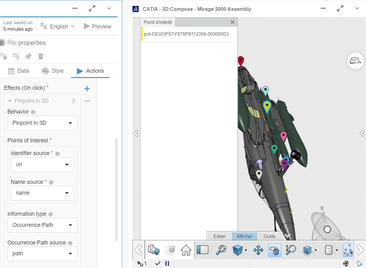
Interact with a 3D Widget to Display Points of Interest (POI)
You can display Points of Interest (POI) in widgets having 3D capabilities (ENOVIA widgets such as 3D Navigate, or 3D Compose) based on items returned by data queries.
Instead of coloring parts, the 3D widget displays pinpoints with different colors to highlight elements on the loaded product structure.
- In the Properties panel, go to Actions.
- Click to add a Menu action.
- Click to add a new Effect (On click).
- For Behavior, select Pinpoint in 3D .
- For Points of Interest, indicate the Identifier source, that is the field to use as URI/physicalid.
- For Information type, select:
- Reference ID: It is useful to identify one or several occurrences of a part in the loaded structure. However, you cannot differentiate specific occurrences of the same part. To use this option, also select the Reference ID Source.
Note:
To use this option, also select the Reference ID Source.
- Occurrence Path: It is useful when your 3D model uses the same part several times, as it allows you to identify the specific occurrences of the part in the loaded structure. For example, for a car, you can have 4 wheels, but you want to identify precisely each of the wheels.
Note:
To use this option, also select the Occurrence Path Source.
- Optional:
Add graphic layers.
A layer represents a group of pins. You can specify the
Name and the Color
that you want to associate with the layer, and that the 3D Widget
Graphical Properties panel will
display. Note:
When similar Points of Interest are very close to one
another on the product structure, the UI may display a single
pinpoint with the number of occurrences of the part.
Interact with a 3D Widget to Select a 3D Part
You may want to highlight 3D parts in widgets that have or do not have 3D capabilities.
- For widgets having 3D capabilities (ENOVIA widgets such as 3D Navigate, or 3D Compose), clicking an object in the Data Perspective highlights the part in the product structure.
- For widgets that do not have 3D capabilities but support the selection event (for example, widgets that display tables where each row represents a part), clicking an object in the Data Perspective displays a selected check box on the row corresponding to the selected part.
- In the Properties panel, go to Actions.
- Click to add a Menu action.
- Click to add a new Effect (On click).
- For Behavior, select Select 3D Part.
- Optional: If you want to zoom on the part in the product structure, activate Focus on 3D Part.
- For Information type, select:
- Reference ID: It is useful to identify one or several occurrences of a part in the loaded structure. However, you cannot differentiate specific occurrences of the same part. To use this option, also select the Reference ID Source.
Note:
To use this option, also select the Reference ID Source.
- Occurrence Path: It is useful when your 3D model uses the same part several times, as it allows you to identify the specific occurrences of the part in the loaded structure. For example, for a car, you can have 4 wheels, but you want to identify precisely each of the wheels.
Note:
To use this option, also select the Occurrence Path Source.
Add Target Lines to the Chart
You can add one or several target lines to the chart. The line will be
perpendicular to the axis on which it is configured.
|