 |
- Restore Default
-
Restores initial values for all properties.
- Initialized based on CAD data, these values can be modified and/or
overloaded (without impacting the CAD data).
|
 |
- Save as Default
-
Sets the values of all current properties as the new neutral values. This may be useful to
retrieve object properties in all your scenarios, for example.
|
|
Essentials |
- Name
-
Specifies the object name. This name appears in the experience but not
in the
Dressups pane. It is the default tooltip text.
- Style
- Lets you change the markup style. For example:
| |
No style
|

|
Arrow Corporate
|

|
Arrow Standard
|

|
Arrow Detail
|
- Color
-
Specifies the actor color.
- Opacity
-
Specifies the opacity, from transparent to solid).
- Closed polyline
- Adds a line between the start and end points to close the
polyline.
- Always On Top
-
Makes the actor visible even when a geometry actor covers it.

|

|
| Cleared
|
Selected
|
|
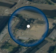
| Circle |
- Radius
- Specifies the circle radius.
- Color
- Specifies the circle color.
- Background Type
- Lets you define the filling of the circle. You can choose between:
- Empty to make the inside of
the circle transparent.
- Gradient the make the inside
of the circle filled with a gradient between the
selected color and opacity (default).
- Fill to solidly fill the
circle with the color defined through the
Color slider.
- Billboard Type
- Lets you specify the markup orientation. You can choose between:
- None to keep the markup
position.
- Spherical to set the circle
parallel to the world frame with the size relative
to the screen.
- In Paper
- Defines the size in the paper space. When you resize the
viewport or zoom the paper space, the markup scales
accordingly. To define size as fixed in the viewport,
deactivate this property.
|
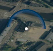
| Arrow
|
- Fixed Length
- Specifies the required length of the arrow. The length is
defined according to paper dimensions in the
Length box that appears when
Fixed Length is activated.
- In Paper
- Defines the size in the paper space. When you resize the
viewport or zoom the paper space, the markup scales
accordingly. To define size as fixed in the viewport,
deactivate this property.
- Billboarded
- Sets the arrow parallel to the world frame with the size
relative to the screen.
|
| Extremity 1 and 2
|
- Body Color
- Specifies the body color.
- Width
-
Specifies the line width, in millimeters.
- Show Head
- Displays the arrowhead.
- Length
- Specifies the length for the markup.
- Size
-
Specifies the size of the extremity symbol.
- Shape
- Specifies where the arrowhead meets the shaft specified as a
ratio of head length.
|
| Border
|
- Border Color
- Specifies the color for the extremity border.
- Width
-
Specifies the border line width, in millimeters.
- Dash Type
-
Specifies the style of the border line. You can choose between the following
options:
- Plain - normal border
- Small Dash - dashed border line with many small dashes
- Medium Dash - dashed border line with medium length dashes
- Dot Dash - dashed line, alternated with dots and lines
- Long Dash - dashed line with few long dashes
- Dot - dotted line
- Very long Dash - dashed line with very few, very long dashes
|
| Front Line - Polyline
|
- Color
-
Specifies the line color.
- Width
-
Specifies the line width, in millimeters.
- Dash Type
-
Specifies the style of the border line. You can choose between the following
options:
- Plain - normal border
- Small Dash - dashed border line with many small dashes
- Medium Dash - dashed border line with medium length dashes
- Dot Dash - dashed line, alternated with dots and lines
- Long Dash - dashed line with few long dashes
- Dot - dotted line
- Very long Dash - dashed line with very few, very long dashes
|
| Back Line - Polyline
|
- Color
- Specifies the line color.
- Width
- Specifies the line width.
- Dash Type
- Specifies the back line type.
|
| Interactions |
Drag the slider to display the following option:
- Type
-
Nature of the event triggered by the user interaction. Choose one of
the following:
| Web address
|
An internet address.
|
| Go to scenario
|
Changes the current view to play the selected scenario.
|
| Play scenario
|
Plays the selected scenario from the current position in
the timeline.
|
Note:
The selected action is applied when the Trigger Actions
 command is activated. command is activated.
- Hyperlink
- Defines the file, web address, marker or scenario linked to the actor.
|


