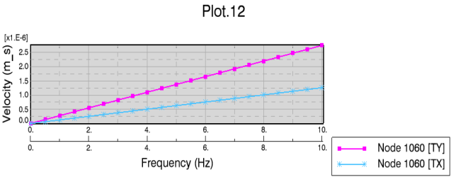
Modify Curve Options Except Associating Axes
You can modify the legend and appearance of curves in an XY plot.
-
Right-click anywhere in the plot window, and select
Options.
The Options dialog box appears.
- Select the item Curve.
-
In the
Curve list, select the curve you want to
modify.
All your following modifications will be applied to the selected curve until you select another curve.
-
To remove the selected curve, click
Remove Curve.
Tip: You can also remove a curve by right-clicking the chart and select Edit > Remove Curve. -
To modify the display unit for the curve, do the following:
-
In the
Unit column, click the unit for the
curve.
A list appears for the unit.Note: The default unit is indicated by the text Default after the unit.
- Select unit from the list.
The display unit is changed in the dialog box and in the curve legend.Note: If you want to change the display units themselves, you do this from Me > Preferences > App Preferences > 3D Modeling
> Multi Discipline Automated Engineering > Knowledge
Basics, the
Units tab.
-
In the
Unit column, click the unit for the
curve.
-
To modify the name of the selected curve, edit the text in the
Name text box:
The default curve name is, for example, in the case of a 2D display for a dynamic solution, composed of the number of the selected node and the selected component.
- To change the default name to a new name, type the new name.
- To revert to the default name, clear the text box.
- Optional:
To remove the appended unit for the curve in the legend, clear
Append unit.
By default, Append unit is active.
-
Modify the display properties of the line that represents the
selected curve.
- Optional:
To hide the line that represents the selected curve, clear
Show line.
By default, Show line is active. It must be active when you edit the below.
Default curve display: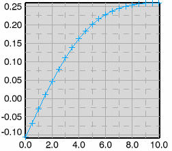
Result if Show line is cleared:

- Modify the color, the thickness, and the line type of the curve line.
- Optional:
To hide the line that represents the selected curve, clear
Show line.
-
Modify the display properties of the symbols that represent the
values of the selected curve.
- Optional:
To hide symbols on the curve, clear
Show symbol.
By default, Show symbol is active. It must be active when you edit the below.
For result, see figures below.
- Modify the color and the symbol type.
-
Activate
Frequency to display the symbols with a
selected frequency, and select the frequency.
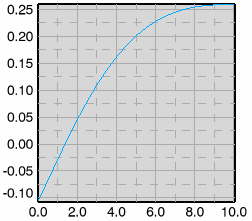
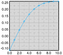
By default, Frequency is active with the value 0, meaning that no values are marked with symbols.
Note: Frequency and When Y changes cannot be active at the same time.An example:Curve if frequency equal to 0 (default), or if Show symbol is cleared:
Frequency equal to 1:

Frequency equal to 2:
-
Activate
When Y changes if symbols should only
appear when the Y axis change.
By default is When Y changes cleared.
Note: When Y changes and Frequency cannot be active at the same time.
- Optional:
To hide symbols on the curve, clear
Show symbol.
- Optional: Associate axes. For associating axes, see below.
- To confirm the modifications and close the dialog box, click OK.

