Creating the Effects Graphs
You can create effects graphs.
- If not already done, open the DoE output Excel file.
- Click the Chart Wizard command.
- Select the Line as Chart type and click the NEXT command.
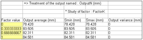
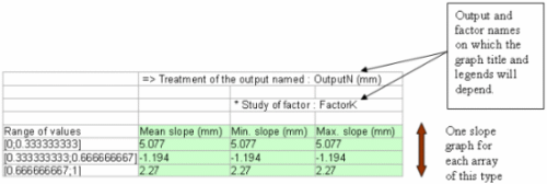
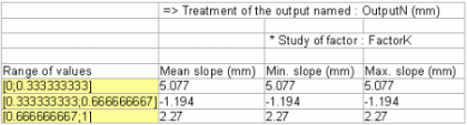
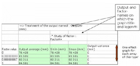
- In the Data Range tab:Insert the pointer into the Data Range box and select the following highlighted range in the sheet.
- Check the Columns option in the Series In box.
- In the Data Range tab :
- Do not modify the content of the Series frame.
- Insert the pointer into the Category (X) axis labels box and select the following highlighted range in the sheet and then click next.
- Click NEXT.
- In the Titles tab:
-
Chart Title = Mean effect of FactorK on OutputN (surrounded by min. and max. effect)
- Category (X) axis = VALUE of FactorK
- Value (Y) axis = Average of OutputN (output's unit) responses (surrounded by min. and max. responses)
-
- Leave the other tabs unchanged and click NEXT.
- Choose the As Object in : Sheet1 option.
- Click FINISH.