Status Breakdown
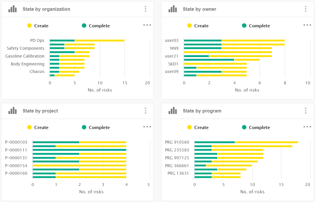
These series of charts display the number of risks in each status,
broken down over different analysis axes, such as organization, owner, etc. Those charts
share the same configuration for display and interactions, but on a different facet.
| Business Objects |
Risk (data model class "risk") |
| Values (or X-Axis and Y-Axis) |
- X-Axis: number of risks in each status (stacked)
- Y-Axis: facet categories (organization, owner, project, or program)
|
| Sorting |
The results are alphanumerically sorted, by category name. |
| Limits |
By default, only the top 10 categories are displayed. Note:
You can change
the pagination to display all the categories by clicking  . .
|
| Colors |
Colors are configured in Preferences. For more
information, see Configuring Facet Displays. |
| Available Views |
Stacked bar chart, full screen view and table view. |
| Interactions |
On this chart, you can:
- Click the Y-Axis label to refine on corresponding category
- Click stack elements to refine on corresponding state
- Draw a rectangular area on the chart using drag-and-drop zooms on this
area
- Click
 to switch to fullscreen display to switch to fullscreen display
- Click
 to
switch to table display to
switch to table display
|
| Technical Details |
- Data model
-
Class: risk
-
Inherited from document
- Property: owner
- Property: related_project
- Property: related_program
- Inherited from
project
- Property: project_related_organization
- Mashup feed
- Multidimensional facet from search logic
- status_by_proj:
current
and related_project
- Multidimensional facets created on feed (project):
- status_by_org:
current and
project_related_organization
- status_by_own:
current and
owner
- status_by_prog:
current
and related_program
|
Variants
| Title |
Bars |
Facet |
Aggregations |
| Status by organization |
Organization |
status_by_org |
count |
| Status by owner |
Owner |
status_by_own |
count |
| Status by project |
Project |
status_by_proj |
count |
| Status by program |
Program |
status_by_prog |
count |
Age Breakdown
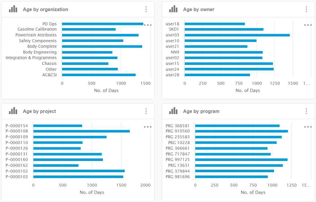
These series of charts display the age of open risks (number of elapsed days since risk
opened), broken down over different analysis axes, such as organization, owner, etc. Those
charts share the same configuration for display and interactions, but on a different
facet.

| Business Objects |
Risk (data model class "risk") |
| Values (or X-Axis and Y-Axis) |
- X-Axis: number of days
- Y-Axis: facet categories (organization, owner, project, or program)
|
| Sorting |
The results are alphanumerically sorted, by category name. |
| Limits |
By default, only the top 10 categories are displayed. Note:
You can change
the pagination to display all the categories by clicking  . .
|
| Colors |
The color of this chart is blue and is configured in
Preferences. For more information, see Configuring Facet Displays. |
| Available Views |
Bar chart, full screen view, and table view. |
| Interactions |
On this chart, you can:
- Click the Y-Axis label to refine on corresponding category.
- Draw a rectangular area on the chart using drag-and-drop zooms on this
area.
- Click
 to switch to fullscreen display. to switch to fullscreen display.
- Click
 to
switch to table display. to
switch to table display.
|
| Technical Details |
- Data model
-
Class: risk
-
Inherited from document
- Property: owner
- Property: related_project
- Property: related_program
- Inherited from
project
- Property: project_related_organization
- Mashup feed (open_project)
- Aggregations added on facet (depending on chart variant)
- age:
AVG(1.0*#ndays(#extract(document_ram_datetime,'project_actual_start_date')?
=
#extract(document_ram_datetime,'project_estimated_start_date'),#now()))
|
Variants
| Title |
Bars |
Facet |
Aggregations |
| Age by organization |
Organization |
age_by_org |
age |
| Age by owner |
Owner |
age_by_own |
age |
| Age by project |
Project |
age_by_proj |
age |
| Age by program |
Program |
age_by_prog |
age |
Duration Breakdown
These series of charts display the duration of risks (number of days between actual start
and actual end), broken down over different analysis axes, such as organization, owner,
etc. Those charts share the same configuration for display and interactions, but on a
different facet.
| Business Objects |
Risk (data model class "risk") |
| Values (or X-Axis and Y-Axis) |
- X-Axis: number of days
- Y-Axis: facet categories (organization, owner, project, or program)
|
| Sorting |
The results are alphanumerically sorted, by category name. |
| Limits |
By default, only the top 10 categories are displayed. Note:
You can change
the pagination to display all the categories by clicking  . .
|
| Colors |
Colors are configured in Preferences. For more
information, see Configuring Facet Displays. |
| Available Views |
Bar chart, full screen view and table view. |
| Interactions |
On this chart, you can:
- Click the Y-Axis label to refine on corresponding category.
- Click stack elements to refine on corresponding duration
- Draw a rectangular area on the chart using drag-and-drop zooms on this
area.
- Click
 to switch to fullscreen display. to switch to fullscreen display.
- Click
 to
switch to table display. to
switch to table display.
|
| Technical Details |
- Data model
-
Class: risk
-
Inherited from document
- Property: owner
- Property: related_project
- Property: related_program
- Inherited from
project
- Property: project_related_organization
- Mashup feed
- Multidimensional facets created on feed (project):
- duration_by_org:
closure_days_custom and
project_related_organization
- duration_by_proj:
closure_days_custom and
related_project
- duration_by_own:
closure_days_custom and
owner
- duration_by_prog:
closure_days_custom and
related_program
closure_days_custom created in trigger
CreateDynamicDateRangeFacet (it creates a date
range facet with ranges defined in preferences) from virtual field:
#ndays(#extract(document_ram_datetime,'project_actual_start_date'),
#extract(document_ram_datetime,'project_actual_finish_date'))
|
Variants
| Title |
Bars |
Facet |
Aggregations |
| Duration by organization |
Organization |
duration_by_org |
count |
| Duration by owner |
Owner |
duration_by_own |
count |
| Duration by project |
Project |
duration_by_proj |
count |
| Duration by program |
Program |
duration_by_prog |
count |
RYO Type Breakdown
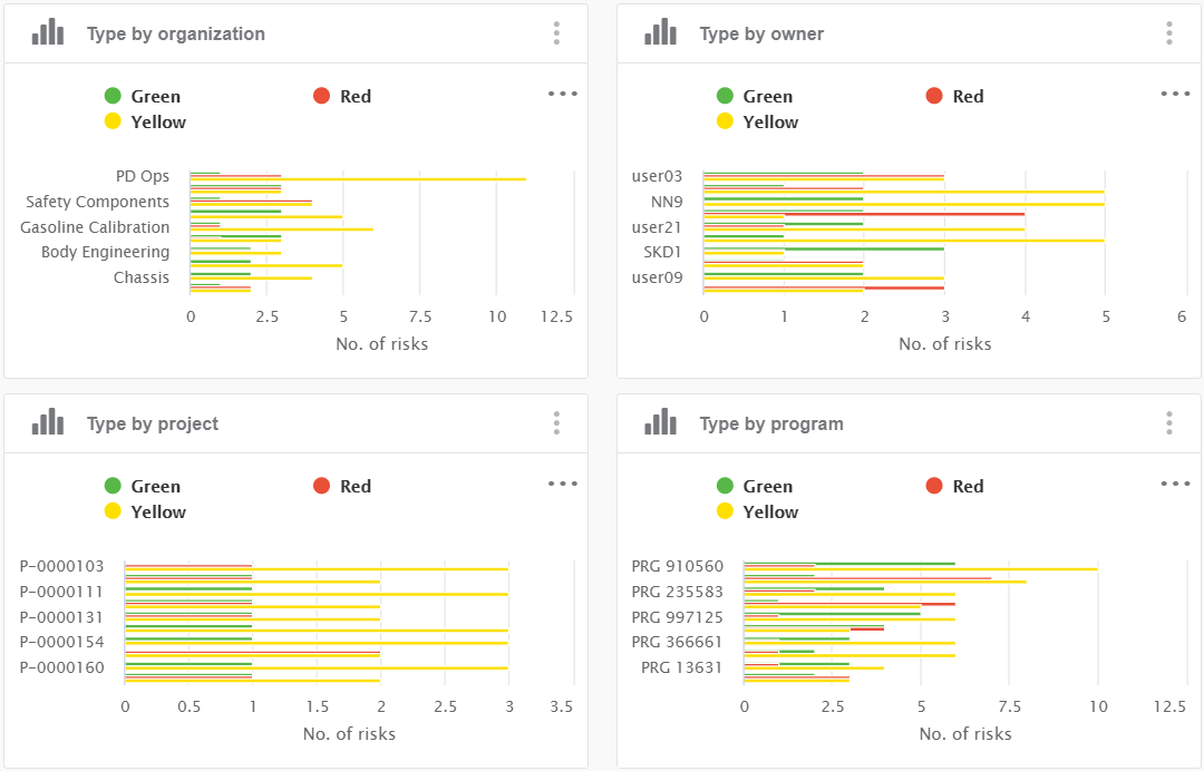
These series of charts display the probability-impact color (red-yellow-orange or
"ryo" status), broken down over different analysis axes, such as
organization, owner, etc. Those charts share the same configuration for display and
interactions, but on a different facet.

| Business Objects |
Risk (data model class "risk") |
| Values (or X-Axis and Y-Axis) |
- X-Axis: number of risks in each ryo status (stacked)
- Y-Axis: facet categories (organization, owner, project, or program)
|
| Sorting |
The results are alphanumerically sorted, by category name. |
| Limits |
By default, only the top 10 categories are displayed. Note:
You can change
the pagination to display all the categories by clicking  . .
|
| Colors |
Colors are configured in Preferences. For more
information, see Configuring Facet Displays. |
| Available Views |
Stacked bar chart, full screen view and table view. |
| Interactions |
On this chart, you can:
- Click the Y-Axis label to refine on corresponding category.
- Click stack elements to refine on corresponding state.
- Draw a rectangular area on the chart using drag-and-drop zooms on this
area.
- Click
 to switch to fullscreen display. to switch to fullscreen display.
- Click
 to
switch to table display. to
switch to table display.
|
| Technical Details |
- Data model
-
Class: gate
-
Inherited from document
- Property: owner
- Property: related_project
- Property: related_program
- Inherited from
project
- Property: project_related_organization
- Mashup feed (project)
|
Variants
| Title |
Bars |
Facet |
Aggregations |
| Completion by organization |
Organization |
completion_by_org |
count |
| Completion by owner |
Owner |
completion_by_own |
count |
| Completion by project |
Project |
completion_by_proj |
count |
| Completion by program |
Program |
completion_by_prog |
count |
|

 .
.