About X-Y Plots | |||||
|
| ||||
X-Y Plot Content
You cannot print an X-Y plot, and X-Y plots are not saved in a results report. You cannot use X–Y plots of your history output data to preprocess simulation data; for example, to describe material behavior or an amplitude curve.
X–Y plots and their plot options are saved along with your simulation. You can view the X-Y plots in your simulation from the Feature Manager.
Curve Appearance and Behavior
You can display multiple curves in a single chart. Curves can share a common axis, or you can create multiple axes and associate an axis with a curve. You can use plot options to control the appearance of each curve and axis and the overall appearance of the X-Y plot. If several curves are displayed in the same chart, when you pass the cursor over a particular curve, the curve and its associated axes are highlighted.
Zoom and Probe
You can zoom in to a selected area of a curve by selecting one corner of the area to be
enlarged and dragging the pointer to the opposite corner. The curve zooms in to the
view, and the axis values are updated. Standard mouse controls allow you to pan
within the chart area. Each time you zoom or pan, the history is saved. You can step
backward through your actions by clicking  . Finally, you can restore the
default plot view by clicking
. Finally, you can restore the
default plot view by clicking  or double-clicking the chart area.
The Probe tool  displays a vertical cursor (line)
on the chart. The double arrow cursor
displays a vertical cursor (line)
on the chart. The double arrow cursor  appears to
indicate when you can drag the vertical cursor. When you drag the vertical cursor
across the chart, the tool displays the X-axis coordinate and the Y-coordinates of
the intersection of the line and each curve. In addition, when you move the pointer
along a curve, the X- and Y-coordinates of the pointer are displayed. In both cases,
the coordinates display the value appended with the appropriate unit label. If you
zoom or pan within the chart area, the vertical cursor might align to the left or
right edge of the chart, but it remains visible.
appears to
indicate when you can drag the vertical cursor. When you drag the vertical cursor
across the chart, the tool displays the X-axis coordinate and the Y-coordinates of
the intersection of the line and each curve. In addition, when you move the pointer
along a curve, the X- and Y-coordinates of the pointer are displayed. In both cases,
the coordinates display the value appended with the appropriate unit label. If you
zoom or pan within the chart area, the vertical cursor might align to the left or
right edge of the chart, but it remains visible.
Value Indicators and Information about the Curve
You can use indicator markers and tooltips to display information about the curve, such as the local maximum and minimum or the slope and number of data points.
Indicator markers display the value on the curve for a specific X
or Y coordinate, including the minimum or maximum value for the entire curve or for
a range of values you specify. For example, you can create an indicator marker to always display the Y value at a specified X value. In the following example,
the user has specified a Value at X type indicator at the
X-axis value of 4 seconds. As a result, the corresponding Y-axis value, 1.17745e-05
Joules, is displayed. 
You can also find the
maximum or minimum values of a curve. In this example, the user has specified a
Maximum type indicator for the X-axis range from 7.5 to
9.5. Although there is a higher peak at Mode 7, the highest peak within the
specified range occurs at Mode 9. The black horizontal line displays the specified
range, and the small vertical line within this range indicates the maximum
eigenvalue at -0.0461608. 
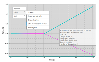
X-Y Plot Legends
The legend displays the name of each curve in the X–Y plot and the color with which
each curve is rendered. The curve is named for the history or field output variable.
You can show the legend by clicking  and you can hide the legend by
clicking
and you can hide the legend by
clicking  . If your X–Y plot includes a large
number of curves, the plots viewer disables the display of the legend so that it
does not occupy an inordinate amount of space.
. If your X–Y plot includes a large
number of curves, the plots viewer disables the display of the legend so that it
does not occupy an inordinate amount of space.