Viewing the Input To and Output From a Simulation Process | |||||
|
| ||||
-
From the Properties page that appears, select
 .
.
Performance Study displays an impact graph for the selected simulation process showing the input and output. An example of an impact graph is shown in the following figure:
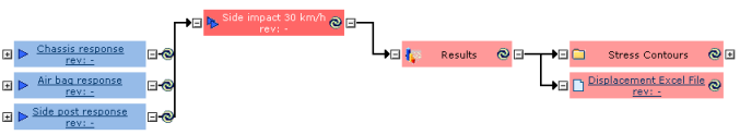
The selected simulation process is shaded in a darker color to indicate that it is the root. Inputs to the root appear to its left, outputs appear to its right.
-
Click on the
 symbol inside the colored box to bring an entity up to date.
If the entity is a simulation activity, you must run the activity to bring it up to date. If the entity is a document, Performance Study marks it as up to date. If the entity is a data category or simulation folder, Performance Study marks it and everything it contains as up to date.
symbol inside the colored box to bring an entity up to date.
If the entity is a simulation activity, you must run the activity to bring it up to date. If the entity is a document, Performance Study marks it as up to date. If the entity is a data category or simulation folder, Performance Study marks it and everything it contains as up to date. - Click on the
 and
and  symbols to expand or contract the next level of entities.