About Objective Comparison Plots | |
| |
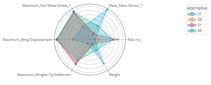
The Objective Comparison view provides a radar plot of the relative value of the parameters
defined as objectives.
The outermost points in the Objective Comparison view are always the best points for meeting the objective. If the objective is to maximize the parameter, the data point with the largest value of the parameter is plotted on the outside. Conversely, if the objective is to minimize the parameter, the data point with the smallest value of the parameter is plotted on the outside. The scale of the axes for each parameter is arbitrary: the data point that is the best match for the objective is plotted near the outer edge; the data point that is the worst match for the objective is plotted near the center; intermediate data points are scaled between the extrema accordingly.
If a parameter group contains one or more parameters that were defined as objectives, Results Analytics creates a score for the group, and the Objective Comparison view shows the score for the group for each data point. You can click the group name in the Objective Comparison view to expand the group and to see a comparison of the parameters in the group (the parameters that you defined as objectives).
If a group of parameters are on one axis, you can click the name of the parameter to drill
down and see an objective comparison for those parameters. From the upper
right
of the visualization, click ![]() to move out one level in
the plot. Click
to move out one level in
the plot. Click ![]() to return to the
highest level of the plot and view all parameters.
to return to the
highest level of the plot and view all parameters.