About Pareto Charts | ||||
|
| |||
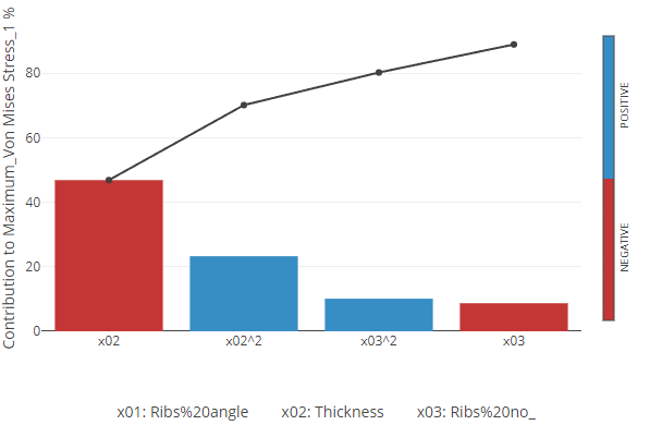
The bars in the Pareto chart show the impact of each factor, with less impact as you move right along the chart. The total of each factor is measured on the Y-axis on the left. The line measures the cumulative total for each factor. You can select whether to show this as a percentage on the Y-axis to the right.