About Rank and Score Breakdowns | ||||
|
| |||
Each row corresponds to an
alternative,
and the colors in the row each represent a parameter according to the key at the bottom of the
visualization. The length of each colored section, or parameter, equates to the score; the
total length of the bar means a higher score, and therefore, a higher ranking.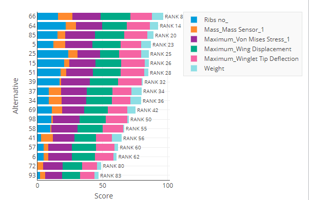
The rank and score breakdown is helpful to see the impact of each parameter on an alternative's rank when compared with other parameters and other alternatives.
If there is a group of parameters in the visualization,
you
can click the parameter group's colored section in any row of the chart to
show the scores for those parameters, broken out in new colors. From the upper right of the
visualization, click  to move out one level in
the plot. Click
to move out one level in
the plot. Click  to return to the
highest level of the plot and view all parameters.
to return to the
highest level of the plot and view all parameters.