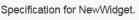
Page Header | ||
| ||
 . In the same way, if you
change something in the page that also shows in the header, such as editing the item's
name, the change does not show in the header until you click
. In the same way, if you
change something in the page that also shows in the header, such as editing the item's
name, the change does not show in the header until you click
To view the page header, select an item from the list page or open an item.
The page header can include the items listed here. Not all headers include all of these pieces, and some items might show additional details. You can hover over parts of the header to view more details. You can click an item to open it, or, for counters with a value greater than one, to view the list of items.
| Page Header Component | Description | ||||||||||||
|---|---|---|---|---|---|---|---|---|---|---|---|---|---|
 |
Drop zone for an image for an item. You can:
|
||||||||||||
 |
Details about the current item:
|
||||||||||||
 |
The description of the item. |
||||||||||||
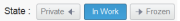 |
The previous, current, and next state of the item's lifecycle. You only see states other than the current state if you have promote and demote access. You can:
If you click a state to promote or demote it and the following message appears, "Operation Failed," open the lifecycle to see where it is blocked. Not all page headers include the state. For example, Inbox Tasks, Bookmark Root, Bookmark, and Routes do not show the state. |
||||||||||||
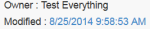 |
The owner's name and the last date the item was modified. Click the date to view the history page for the item. | ||||||||||||
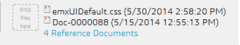 |
Drop zone to add files to an item. The file name and information about the last two checked in files appear beside the drop zone. The total number of documents appears under this information. Drag one or more files into this zone to check in documents, if you have check in access. During the check-in process the drop zone turns orange and shows the progress of the file check-in. If the item is a document, the dropped files are checked into that document. If the item is any other type, the dropped files are added as documents in the Reference Document category for the item. For files that display next to the drop zone, you can:
You cannot drop files from within a browser window to the drop zone. That is, you cannot drag documents shown in a column to the drop zone. |
||||||||||||

|
Shows above the navigation pane. Drops-down a menu of the categories for the active app. | ||||||||||||
|
|
||||||||||||
 |
Shows the collaborative space of the content. Only shows if the content belongs to a collaborative space other than the active collaborative space shown in the top bar. |
 shows if a higher revision of this item exists.
  to
view information about a file.
to
view information about a file. 
 or Forward


