Define the Data to Show
-
In the Properties panel, go to
 Data.
Data.
-
Select a data query and a Result Set.
Define the Chart Title and Icon
-
In the Properties panel, go to
 Style.
-
Specify the chart title.
Note:
To localize this title in other languages, click  , and
select a translation key. You define keys and translation values in the
Translation menu. , and
select a translation key. You define keys and translation values in the
Translation menu.
-
Select the icon that represents your chart.
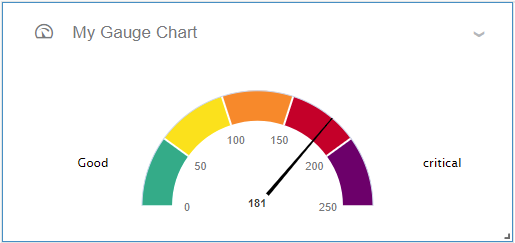
Define the Intervals
-
In the Properties panel, go to
 Targets.
-
Use the Minimum property to represent the lowest value.
-
Define each area interval by specifying a threshold value, a color, and optionally a
label.
Note:
There must be at least 1 interval but there is no fixed number of areas.
-
Use the last interval to define the end of the gauge.
|