About XY Plot | ||||
|
| |||
XY plot can be used to visualize, for example:
- Probe results in the Mechanical Systems Experience app.
- Watchlist results in the Behavior Experience app.
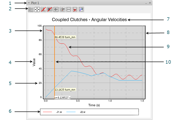
The following are the different elements of a simple plot:

- Plot Note: The plot is an immersive panel.
- Plot toolbar
Notes:
- The content of the toolbar differs between apps.
- The toolbar is not present in the Mechanical Systems Experience app.
- Axis
- Axis title
- Label
- Legend
- Title
- Chart Note: Some apps may have more than one chart in the same plot.
- Curve
- Cursor along x-axis (vertical cursor)
The plot and each part of the plot can be modified:
If several curves are displayed in the same chart with different magnitudes and different axes, when you pass the cursor over a particular curve, the curve and its associated axes are highlighted.
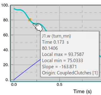
When you pass your cursor over a curve, a
tooltip appears:

By default, the tooltip contains the following information:
- The signal name, with unit in brackets
- The x axis value and unit
- The y axis value
- The local max
- The local min
- The slope
- The origin of the signal (the title of the corresponding simulation)
You can select to only display the three
first items and the last one in the list above in the tooltip:

You control the amount of information in the tooltip by right-clicking the chart and selecting .