Create a custom widget property
-
Click Create property and set the options as described in the following table.

Table 1. Add widget property panel description Option
Description
ID
Enter the ID of the widget property.
Name
Enter the name of the widget property.
Arity
Specify the arity of the widget property. The arity is the number of arguments that the function takes.
- ONE: For unary operator
- ZERO_OR_ONE: For binary operator
Description
Enter a description for the widget property.
Placeholder
Specify the placeholder to display to help the user completing the property field. The placeholder disappears as soon as you enter text.
Possible values
Define the property’s values:
If one value is declared, it will behave as a default value.
If several values are declared, a selection box will be displayed.
Is evaluated
Choose whether the widget property will be evaluated and have MEL expressions or not.
Is xml escaped
Choose whether the widget property results will be XML escaped or not, that is to say whether ASCII characters like the angle brackets (<>) will be encoded in XML.
Is url encoded
Choose whether the widget property results will be URL encoded or not.
URL encoding is normally performed to convert data passed via HTML forms, because such data may contain special characters which are not allowed on a valid URL format.
Check functions
Choose an error checking function to validate user input:
- isInteger: Checks that the value is an integer and displays an error message if not.
- isAlphanum: Checks that the value is a chain of alphanumerical characters and displays an error message if not.
- isPageName: Checks that the value is a page name and displays an error message if not.
- isEmpty: Checks that the value is NOT empty and displays an error message if it is the case.
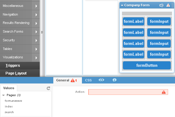
Context menu functions
Specify the types of functions that will be available in the Value tab of the contextual menu displayed on the left of the widget properties panel:
- Aggregations(): Gets all facet aggregations, for example, count, score etc.
- DateFacets(): Gets all Date facets from the feeds used by the widget.
- Eval(): Gets all possibilities evaluated by the widget. The possible attributes are: facet, category and meta.
- Facets(): Gets all facets from the feeds used by the widget.
- Feeds(): Gets all the feeds used by the widget.
- Fields(): Gets all the virtual fields, numerical fields and RAM-based fields from the feeds used by the widget.
- GeoFacets(): Gets only Geographical facets from the feeds used by the widget.
- Hierarchical2DFacets(): Gets only Hierarchical2D facets from the feeds used by the widget.
- Metas(): Gets all metas from the feeds used by the widget.
- MultiDimensionFacets(): Gets Multi-dimension facets from the feeds used by the widget.
- Normal facets(): Gets only Category facets from the feeds used by the widget.
- Numerical facets(): Gets Numerical facets from the feeds used by the widget.
- appendOnChange(', '): A click of the user on a dynamic list, will append the given string after the current option value.
- emptyOnChange(): A click of the user on a dynamic list, will remove the current option value before setting the clicked value.
- PageParameters(): Gets the page parameters names
- Pages(): Gets the names of available pages.
- Sorts(): Gets all the feed elements that can be sorted.
- WUIDS(): Gets the list of this page Widget’s unique IDs.
Display functions
Specify how the property will be displayed. For example, you can force the property to act as a select box, force it to act as an input (default is Text area), force it to act as a password input, etc.
- Code Editor: Transforms the property's input field into a code editor
- Number: Transforms the property's input field into a number input field.
- Password: Transforms the property's input field into a password input field (encrypted).
- Radio: Transforms the property's input field into a radio button.
- SetHeight: Sets the minimum height (in terms of lines) of the option's input field.
- TextEditor: Transforms the property’s input field into a rich text editor.
- TextArea: Transforms the property's input field into a text area field.
-
ToggleDisplay: Shows/hides properties conditionally depending on the selected property value.
For example, value1 of PropertyA will display PropertyB and PropertyD, value2 will display PropertyB and PropertyC.
You need to set:
- the value to match (using the
valueToMatchandifEqualsattributes) - the options to hide (in
hideOptions) - the options to show (in
showOptions).
- the value to match (using the