Configuring Merchandising Guides

You can configure merchandising guides to customize the content displayed in the generated documents. For example, you can configure the logo, the sections displayed, and the columns of the products table. You can define templates to fit your needs. For instance, you can define templates for specific product categories.


Before you begin: You must have the Administrator role (VPLMAdmin). For more information, see: Managing Persons, Roles, Organizations, and Collaborative Spaces in the People & Organizations and Content - Administration guide.

Context:

The 3DMerchandising app offers the capability to print merchandising guides that describe the 3D document and its content. This document is a PDF file composed of four sections. You can opt to display the required sections. Each section is composed of one or several pages. The sections are as follows:

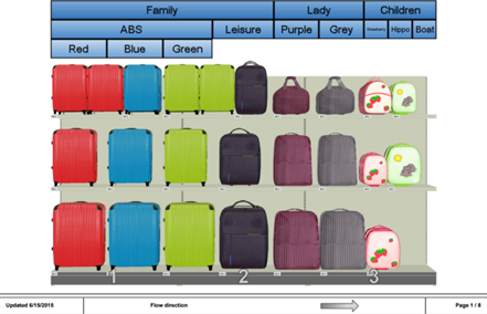
  • Global View section: This is a global overview of the document. The 3D perspective is shown. For Gondolas, it displays the consumer decision tree. The number of gondola sections displayed in each page of this section can be configured.
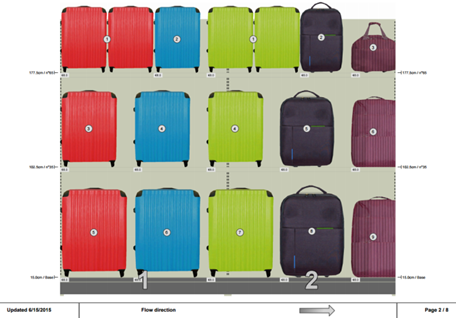
  • Realistic View section: For Gondolas, this section is a 3D projection of the document in a 2D plane. The perspective is not shown. For Scenes, this page is generated from the point of view defined by the user from the Merchandising Guides Configuration command.
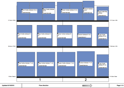
  • Symbolic View section: This section shows a symbolic representation of the document with product positions, numbers, and configurable labels. This page is available only for gondolas.
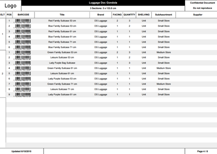
  • Product List section: This section contains a customizable table that shows the list of products in the document.
In addition to this PDF file, an Excel file can be generated with the product list of the document. To configure the merchandising guides, several configuration templates can be created by using an XML file. These templates are available to the user during the printing process.

Example of a merchandising guide template:

<?xml version="1.0" encoding="UTF-8"?>
<templates xsi:noNamespaceSchemaLocation="ENOSHOStoreStudio_MountingInstructions_Templates.xsd"> 
	<templatemaster>
		<logo file=""/>
	</templatemaster>

	<template name="Template Sample" excel="true">
		<logo file="MountingInstructionsLogo.png"/>
		<positionnumbering sameNumberForSameProduct="false" positionOfBullet="topLeft" isNumberPlacedonVisiblePart="true"/>
		<globalviewpage visible="true" sectionperpage="4"/>
		<realisticviewpage tags="true" visible="true"/>
		<viewpointpage imageWidth="75" tableWidth="25">
			<column id="TITLE"/>
		<!--You can add any attribute you want in the viewpointpage tag, see documentation for more information -->
		<!--<column select="attribute[SHOAtt_Brand]"/>-->
		</viewpointpage>
		<inventorypage visible="true"/>
		<symbolicviewpage visible="true">
			<annotation id="TITLE"/>
		</symbolicviewpage>
		<productlistpage visible="true">
			<column id="CDT_PATH" align="center" width="30" split="true" pdf="false"/>	
			<column id="ELT" width="3" align="center"/>
			<column id="POS" width="3" align="center"/>
			<column id="BAR_CODE" width="10" align="right"/>
			<column id="TITLE" width="25" align="center"/>
			<column select="attribute[SHOAtt_Brand]" width="10" align="center"/>
			<column id="FACING_CONTACT" width="5" align="center"/>
			<column id="TOTAL_COUNT" width="6" align="center"/>
			<column id="SHORepresentationShelvingCustomAttribute" width="7" align="center" target="representation"/>
			<column id="SHOProductSubAssortmentCustomAttribute" width="11" align="center"/>
			<column select="attribute[ShopperSupplier]" width="20" align="center"/>
		</productlistpage>
	</template>
</templates>
 

  1. Access the configuration files. For more information, see Access Configuration Files.
  2. In the Configuration Files page, download the default ENOSHOStoreStudio_MountingInstructions_Templates.xml file.
  3. Modify the file to configure the mounting instruction.

    The ENOSHOStoreStudio_MountingInstructions_Templates.xml is composed of one templatemaster node and several template nodes can be added. The templatemaster node denotes the Default Template template. Configurations applied to the templatemaster node are also applied to all the template nodes, unless these configurations are overwritten.

    • Configure the attributes in the template tag.
      Attributes Description Values
      name Defines the name of the .xml template. Text value
      excel Generates or not the mounting instructions document in the .xls format.

      • true
      • false

      Note: The default value is true.
    • Configure the attributes in the logo tag.
      Attributes Description Values
      file Indicates the filename of the logo. This file must be uploaded on the server from the Configuration Files section. JPEG and PNG format are supported. For more information, see Access Configuration Files. Text value
    • Configure the attributes in the positionnumbering tag.
      Attributes Description Values
      sameNumberForSameProduct

      In gondola mode, shows common numbering for same products placed in the same section. The numbering is reset for each section.

      For scenes, 27 products are displayed on each page. Therefore, in scene mode, shows common numbering for same products on the same page. The numbering is reset for each page.

      • true
      • false

      Note: The default value is false.
      positionOfBullet Indicates the position where the number bullet is displayed.

      • Visibility: If the product's visibility is more than 30%, the number is displayed at the center of the bounding box. If the product's visibility is less than 30%, the number is displayed at the center of the visible part. If all sample points are invisible or covered by another product, the number is displayed at the center of the bounding box without interfering with another number bullet.
      • Center: Displays the number at the center of the product's bounding box.
      • Top Right: Displays the number at the upper-right corner of the product's bounding box.
      • Bottom Right: Displays the number at the lower-right corner of the product's bounding box.
      • Top Left: Displays the number at the upper-left corner of the product's bounding box.
      • Bottom Left: Displays the number at the lower-left corner of the product's bounding box.

      Notes:
      • The default value is Visibility.
      • If more products are placed behind a product, the numbers are shown cascaded.
      • Numbers are placed such that they do not overlap or intersect with other numbers.
      isNumberPlacedonVisiblePart Indicates the method to be used to number products.

      • true: new visibility method to be used to number products.
      • false: existing method to be used to number products.

    • Configure the attributes in the globalviewpage tag.
      Attributes Description Values
      visible Displays or hides the overview pages. This attribute is optional.

      • true
      • false

      Note: The default value is true.
      sectionperpage Defines the number of sections displayed on each overview page. This attribute is optional. Numerical value.
      Note: The default value is 4.
    • Configure the attributes in the realisticviewpage tag.
      Attributes Description Values
      tags Displays or hides the numbered tags on the realistic view. This attribute is optional.

      • true
      • false

      Note: When set to true, the numbered tags appear on the realistic view pages. By default, it is set to false. If deleted, its value is set to false by default.
      visible Displays or hides the realistic view pages. This attribute is optional.

      • true
      • false

      Note: The default value is true.
    • Configure the attributes in the viewpointpage tag.

      You can use this tag to add a product information table to the realistic view page. By, default, the title of the product is displayed. You can add multiple column tags to add more information.

      Attributes Description Values
      imageWidth Denotes the percentage of the width of the page dedicated to the image. Any number less than 100. The default value is 75.
      tableWidth Denotes the percentage of the width of the page dedicated to the table. Any number less than 100. The default value is 25. The sum of the widths of the image and the table must be 100.
      id Shows the title of the product. TITLE
      select You can configure this attribute to show additional product information. Any attribute. For example, attribute[SHOAtt_Brand]

      You can retrieve and use custom attributes for the select attribute.

      For example, if you create a custom attribute named Custom Attribute for Merchandising Product, its database name will be XP_MerchandisingProduct_Ext.Custom_Attribute. You can use this attribute as follows: <attribute select="attribute[XP_MerchandisingProduct_Ext.Custom_Attribute]"/>

      You can use these extensions to retrieve custom attributes for various objects.

      XP_MerchandisingAssetDrawer_Ext

      XP_MerchandisingAssetGondolaSection_Ext

      XP_MerchandisingAssetHangingBar_Ext

      XP_MerchandisingAssetPallet_Ext

      XP_MerchandisingAssetPegSupport_Ext

      XP_MerchandisingAssetPeg_Ext

      XP_MerchandisingAssetShelf_Ext

      XP_MerchandisingAssetShortShelf_Ext

      XP_MerchandisingAssetWithRepresentation_Ext

      XP_MerchandisingAsset_Ext

      XP_MerchandisingAssortment_Ext

      XP_MerchandisingComposition_Ext

      XP_MerchandisingGondola_Ext

      XP_MerchandisingProduct_Ext

      XP_MerchandisingRepresentation3D_Ext

      XP_MerchandisingRetailCategory_Ext

      XP_MerchandisingRetailCluster_Ext

      XP_MerchandisingRetailStore_Ext

      XP_MerchandisingScene_Ext

      XP_MerchandisingStore_Ext

      XP_MerchandisingStoryboard_Ext

      XP_MerchandisingSubAssortment_Ext

    • Configure the attributes in the inventorypage tag.
      Attributes Description Values
      visible Displays or hides the furniture inventory page. This attribute is optional.

      • true
      • false

      Note: The default value is true.
    • Configure the attributes in the symbolicviewpage tag.

      Several annotation nodes can be added inside the symbolicviewpage. Each annotation node will contain one id or select attribute that will display the corresponding information inside the product’s annotation of the symbolicviewpage. All the information contained in the annotation nodes is merged into one single frame per product.

      Attributes Description Values
      visible Displays or hides the symbolic view pages. This attribute is optional.

      • true
      • false

      Note: The default value is true.
      id Describes the data source of the annotation. All predefined values except BAR_CODE. See column tag.
      select
      target Defines the source of information of the column. This is used only if select attribute is used. This attribute is optional.

      • product
      • representation

      Note: The default value is product.
    • Configure the attributes in the productlistpage tag.

      The productlistpage node allows you to add, remove, and configure each column of the product list page of the PDF document. It also sets the columns of the generated Excel file (if asked in the template tag).

      Attributes Description Values
      visible Displays or hides the products list in the document.

      • true
      • false

      Note: The default value is true.
    • Configure the attributes in the column tag.
      Attributes Description Values
      id

      Describes the data source of the cell. This attribute is used to fill columns with predefined values, configured values, and business information values.

      Either this attribute or the select attribute must be used.

      Predefined values

      • ELT: corresponds to the number of the element where the facing is placed.
      • POS: corresponds to the position number of the facing in its element.
      • BAR_CODE: corresponds to the UPC displayed as a bar code.
      • TITLE: corresponds to the localized title of the product.
      • CDT_PATH: corresponds to the position of the product in the consumer decision tree.
      • FACING_CONTACT: corresponds to the number of items with visible faces in the facing. Items are in contact with the shelf.
      • FACING_COUNT: corresponds to the number of items with visible faces in the facing.
      • TOTAL_COUNT: corresponds to the number of items of a same product available in the gondola.
      • LOCAL_QUANTITY: corresponds to the quantity of a specific product placed in a specific location.

      Configured values

      With on-premise server, you can fully configure the computation of any value by implementing a standard ENOVIA JPO. ENOVIA JPO can’t be implemented on a Cloud server.

      Configured values

      • SHOProductSubAssortmentCustomAttribute
      • SHORepresentationShelvingCustomAttribute

      Business information values

      stock, linearMeters: corresponds to the business indicators.

      select Describes the data source of the cell. This can be used instead of the id attribute to compute from a product or representation attributes (see target attribute).

      Either this attribute or the id attribute must be used.

      Attributes available with target="product"

      name

      attribute[Weight]

      attribute[Effectivity Date]

      attribute[SHOAtt_Brand]

      attribute[SHOAtt_Color]

      attribute[SubstituteEAN]

      attribute[Title]

      attribute[PCB]

      attribute[RecommendedPublicPrice]

      attribute[ShopperHeight]

      attribute[ShopperLength]

      attribute[ShopperSize]

      attribute[ShopperSupplier]

      attribute[ShopperWeight]

      attribute[ShopperWidth]

      Attributes available with target="representation"

      Attribute[Title]

      Attribute[HangerModel]

      Attribute[SHOPackageIdentifier]

      Attribute[MaximumStacking]

      Attribute[RepNature]

      Attribute[RepPresentation]

      Attribute[ShopperWeight]

      Attribute[ShopperConsumerUnits]

      Attribute[SHOAtt_Rep3DFoldingType]

      Attribute[OutputHeight]

      Attribute[OutputLength]

      Attribute[OutputWidth]

      Attribute[PegStacking]

      target Defines the source of information of the column. This is only used if select attribute is used. This attribute is optional.

      • product
      • representation
      Note: The default value is product.

      width Defines the column width. This attribute is optional and is only available for the .pdf document. To ensure that all columns display correctly, verify that sum of widths for displayed columns is 100% Numerical value (percentage)
      align Defines the text alignment in the table columns. This attribute is optional.

      • center
      • left
      • right

      Note: The default value is center.
      pdf Displays or hides a column from the .pdf document. This attribute is optional.

      • true
      • false

      Note: The default value is true.
      excel Displays or hides a column from the .xls document. This attribute is optional.

      • true
      • false

      Note: The default value is true.
      split Specifies the display method of the CDT_PATH attribute. This Boolean attribute only applies to the CDT_PATH attribute.

      • true: displays one column for each segment.
      • false: displays one column for all segments.
      Note: The default value is false.

      Important: You can only assign one mandatory attribute (id or select) to each column tag.
  4. Upload the modified file.
    For more information, see Update a Configuration File.