Dropdown | |||||
|
| ||||
Example
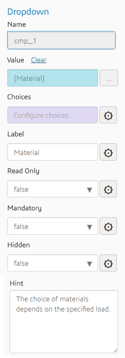
The following figure shows an example of the properties of a Dropdown component. In this example the user selected the Material parameter from the process browser, and the Material parameter was defined with a choice of values.

The following figure shows the resulting output in the customized simulation template.
Steel is the default value for the Material
parameter.
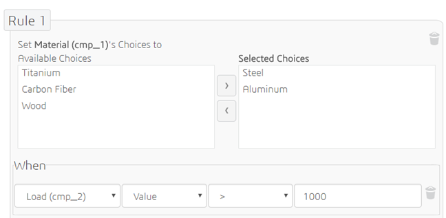
You can create rules that define a dependent list—the choices that are available to the user in the dropdown menu. In the following example, the choice of materials is limited when the load is above a specified value. 
Properties
The Dropdown component has the following properties:
| Property | Description | Type |
|---|---|---|
| Name | The ID of the component (read-only) | String |
| Value | The object with which to bind or the default choice | String, real, integer, or Boolean (provided choices have been defined for the parameter) |
| Choices | Define rules that govern the available choices | N/A |
| Label | Text to display in front of the input field | String |
| Read Only | Whether or not the user can modify the default value | Boolean |
| Mandatory | Whether or not a value is required | Boolean |
| Hidden | Whether or not the component is displayed | Boolean |
| Hint | Text displayed under the list of predefined choices to provide additional information about the values that are available | String |