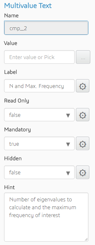
| Name | The ID of the component (read-only) | String |
| Value | The object with which to bind or the default text | String, multiline, real, integer, Boolean, or multival (string, real, or integer) |
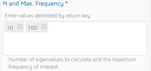
| Label | Text to display above the text area | String |
| Read Only | Whether or not the user can modify the default value | Boolean |
| Mandatory | Whether or not text is required | Boolean |
| Hidden | Whether or not the component is displayed | Boolean |
| Hint | Text displayed under the text area to provide additional information about the input that is expected | String |

