Section | |||||
|
| ||||
Overview
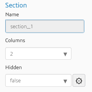
The following figure shows an example of the properties of a Section component:
The following figure shows the two-column Section component in the customized simulation
template. A Density input component has been placed in the left
column, and a Nonlinear check box has been placed in the right
column.
Properties
The Section component has the following properties:
| Property | Description | Type |
|---|---|---|
| Name | The ID of the component (read-only) | String |
| Columns | The number of columns in the section (1–3) | String |
| Hidden | Whether or not the component is displayed | Boolean |