Table | |||||
|
| ||||
Example
The following figure shows an example of the properties of a Table component: 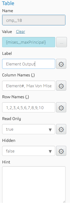
The following figure shows the resulting output in the customized simulation template: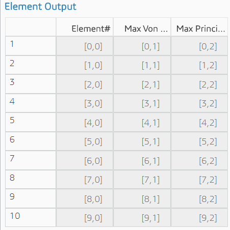
The user can click a table cell and change the value.
Properties
The Table component has the following properties:
| Property | Description | Type |
|---|---|---|
| Name | The ID of the component (read-only) | String |
| Value | The two-dimensional array | Two-dimensional array parameter |
| Label | Text to display above the table | String |
| Column names | Labels above each column | Comma-separated strings |
| Row names | Labels next to each row | Comma-separated strings |
| Read Only | Whether or not the user can modify the default value | Boolean |
| Hidden | Whether or not the component is displayed | Boolean |
| Hint | Text displayed under the table providing additional information about the values in the table | String |