Data Points Feasibility | ||||
|
| |||
Results Analytics classifies each data point and places the point into one of four categories:
- Best
- Dominated
- Infeasible
- Excluded
Results Analytics uses color coding in the table and graphical views to indicate in which category the data point was placed.
Best
Best data points are those for which no improvement can be made in any of the objectives without sacrificing at least one other objective. The best alternatives are called Pareto optimal alternatives and form a Pareto front in the design space. The Pareto optimal alternatives appear as circles in the following figure; the Pareto front appears as a dark line: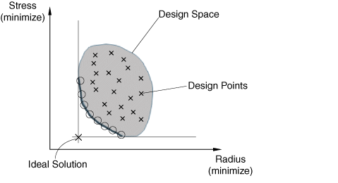
The design space contains a number of Pareto optimal points along the Pareto front. The stakeholders, such as engineering, marketing, and finance, must decide on the preferences that will, in turn, determine which alternatives to recommend. For example, in the above figure, is it more important to minimize the stress or to minimize the radius? The ideal solution minimizes both parameters, but it does not exist in the design space.
Dominated
Dominated data points satisfy all the thresholds; however, for each dominated point another data point with better objectives can be found among the best alternatives. A data point A is said to dominate data point B if both of the following conditions are true:
- A is no worse than B for all of the objectives
- A is strictly better than B in at least one objective
Infeasible
Infeasible data points violate an upper and/or lower threshold.
Excluded
Excluded data points have been explicitly excluded from grading by the user. Results Analytics excludes the data point containing the selected cell from the scoring and ranking (they are given a score of zero). Excluding also excludes a data point from approximations.