Summary | ||
| ||

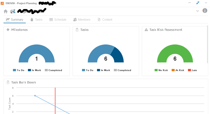
Click the Summary tab to view the charts.
For charts with zero values:
- Milestones, Tasks, and Task Risk Assessment show a grayed-out donut pie chart with the total value as "0".
- Task Burn Down, Resource Usage, and Assignees with Open Tasks show an empty chart with an x and y axis.
| Chart | Description |
|---|---|
| Milestones | A color donut chart represents milestones in the states of "To Do," "In Work," and "Completed." Included are all children milestones and subproject milestones. It also shows the count. If you click a milestone state, the milestones filter shows the total count of the selected state. |
| Tasks | A color donut chart represents tasks in the states of "To Do," "In Work," and "Completed." Included are all children tasks and subproject tasks. It also shows the count for all leaf tasks. If you click a task state, the tasks filter shows the total count of the selected state. |
| Task Risk Assessment | A color donut chart represents tasks at risk in states of "No Risk," "At Risk," and "Late." Included are all children tasks and subproject tasks. If a task is behind schedule, it is included in the "At Risk" count. It also shows the count for all leaf tasks. If you click a task risk state, the tasks filter shows the total count of the selected state. |
| Task Burn Down | A line represents tasks left to do for each week between first task start date and last task end date. The x axis shows the dates, the y axis shows the count for leaf tasks, and a red line indicates today. Hover over any point on the line to see the count of leaf tasks remaining at that time. Bars and pinpoints are centered on the day. |
| Resource Usage | This shows the count of resources assigned for each week between first task start and last task end. The x axis shows the dates, the y axis shows the count, and a red line indicates today. Hover over any point on the line to see the count of resources at that time. Bars and pinpoints are centered on the day. |
| Risk Heat Map | Available only for enterprise projects. This shows a two-dimensional matrix based
on risk probability and impact. The grid categorizes all active risks in different colored zones based on risk priority number. Below is an explanation of how the grid categorizes the project risks based on their risk factor values:
|
| Assignees with Open Tasks | For tasks not yet completed, this shows the assignee names and the count of leaf tasks assigned to each assignee. Included are all children tasks and subproject tasks. |
| Deliverable Count by State | The count and state of deliverables. Deliverables include those for children tasks and subproject tasks, but only for leaf tasks. If you click the state, the deliverables filter shows the total count of the selected state. |
Use these icons in the upper-right corner to expand/collapse the project card and edit the project properties:
| Control | Description |
|---|---|
|
|
Expands/collapses the project card in the header. |
| Lets you edit the properties of the project. |
Schedule Highlights
If you enabled highlights in the Schedule tab, the Schedule Highlights view also shows in the Summary tab.

Click a task bar to show its start and end dates.
For information about creating highlights, see Create and Show Schedule Highlights.