Show or Hide the Component Browser
You can show or hide the
Component Browser.
The
Component Browser is displayed by default.
If minimized or not displayed, do the following:
- If minimized,
the
Component Browser is represented by an icon
 on the right
side of the screen. Click this icon to display it. on the right
side of the screen. Click this icon to display it.
- If not
displayed, from the
View section of the
action bar,
click
Component Browser
 . .
The
Component Browser is displayed.
Notes:
- Replaceable components
are indicated by an "R" on the component icon.
- To prevent you from
closing the
Component Browser, it has no
Close command.
Display Also Parameters, Variables, Constants, and Discrete
Values
You can also select to display parameters, variables,
constants, and discrete values in the
Component Browser, in addition to the default
content.
-
From the Component
Browser header, click Show
Preferences.
-
To display parameters, variables, constants,
and discrete values, activate the Show parameters
preference.
By default, the preference is cleared.
Notes:
- The command is a shortcut to the Show
parameters preference from
, the
Editor tab, the Component
Browser group.
- For all preferences available, see Native Apps Preferences
Guide: Editor.
Parameters, variables, constants, and
discrete values are displayed in the Component Browser, in
addition to the default content. Any exposition to Knowledgeware is indicated by the
icons:
-
 The item is not exposed in
Knowledgeware. The item is not exposed in
Knowledgeware.
-
 The item is exposed in
Knowledgeware. The item is exposed in
Knowledgeware.
-
 The value of the item is
computed from a formula, or has a direct link with another Knowledgeware or
PLM parameter. The value of the item is
computed from a formula, or has a direct link with another Knowledgeware or
PLM parameter.
Display Also the Class of the Components
You can display the class of the components.
Before you begin: Display the
Component Browser of a model.
-
From the Component
Browser header, click Show
Preferences.
-
To display the full class name of each
component, activate the Show reference class path
preference.
By default, the preference is cleared.
Notes:
- The command is a shortcut to the Show reference class
path preference from
, the
Editor tab, the Component
Browser group.
- For all preferences available, see Native Apps Preferences
Guide: Editor.
The full class name
of each component is displayed in brackets after each component.
Reorder the Content
You can sort the components and
connectors in the
Component Browser, in an alphabetical or a reverse
alphabetical order.
Notes:
- For components with no
graphical presentation: the children of the root level only are displayed.
- For parameters: two
hierarchical levels under the root are displayed.
Before you begin:
Display the
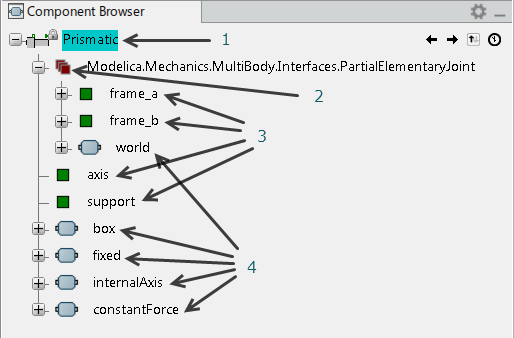
Component Browser. An example of the structure
displayed inside it could be:

The numbers above indicate:
- Active class
- Extended class
- Connectors
- Components.
-
Click
Sort
 . .
Components
and connectors are sorted in an alphabetical order.
-
To sort in a reverse alphabetical
order, click again
Sort
 . .
Components
and connectors are sorted in a reverse alphabetical order.
-
To go back to the initial order,
click a third time
Sort
 . .
The classes
are sorted in the initial order.
Use the Navigation History
You can use the history of your
navigation through models to navigate in the
Component Browser.
Before you begin:
From the
Package Browser, expand your library, activate a
first class
Modelica.Mechanics.MultiBody.Examples.Elementary.DoublePendulum,
then a second class, close to the first one,
PointGravity.
-
Click Previous Activated
Object
 to
display the previous model from the navigation history
( to
display the previous model from the navigation history
(DoublePendulum).
-
Click Next Activated
Object
 to
return to the next model from the navigation history
( to
return to the next model from the navigation history
(PointGravity).
-
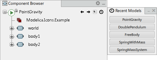
Click Last 5 Activated Models
 to
display the list of the last five objects from the navigation history. to
display the list of the last five objects from the navigation history.
-
Click to activate a model in the list.
|
 on the right
side of the screen. Click this icon to display it.
 .
.
 .
.

