The Multi-Scatter Plot View | |||||
|
| ||||
The multi-scatter plot view displays different slices of the design space or XY plots of the values of two selected parameters. The plot consists of three different representations of the data: scatter plot in the lower left, histograms along the diagonal, and contour plots with correlations in the upper right.
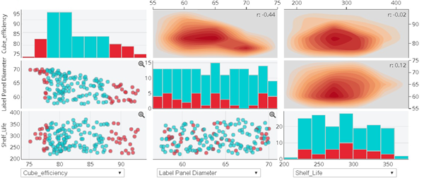
Scatter Plot
Each point on the plot represents a data point (or a row in the table view). Results Analytics displays points for only rows that appear in the table view. The distribution, or scatter, of the plots is an indication of the relationship between one parameter and the other.
Results Analytics uses symbols and colors to provide information about a data point in a scatter plot, as
shown in the following figure:
- Color coding indicates the feasibility of each data point. (The red circles in this example indicate data points with repair costs that exceed the threshold of 1000.)
- Icons indicate which data source was used to create the data point.
- Stars indicate the data points that the user is considering for the recommended alternative and included in the basket.
- A predict icon indicates data points that were predicted by Results Analytics on the Predict page.
Histogram
The histogram view of the data divides the range of the parameter (from the lowest value to
the highest value) into five equal parts and displays the number of data points that fall
into each part. The histogram view gives you an overview of the distribution of the data
points for the selected parameter, as shown in the following figure. The three infeasible
data points from the scatter plot are captured by the two red bars in the histogram
view.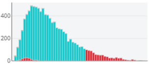
Contour Plot with Correlation
In the upper right of the multi-scatter plot, Results Analytics displays the density contour plot with the correlation coefficient of the X-Y parameters in the upper right corner of each plot. The density counter plot is an unaggregated view of the data and is displayed in shades of red; the darker the red, the higher the concentration of data points.
The contour plot supports data point filtering. For more information, see Data Points Filters.

The correlation coefficient for the x-y parameters is displayed in the upper right corner of the density contour plot. The correlation is a linear representation of the relationship between the two parameters. The correlation coefficient ranges between −1 and 1, where a negative number is an inverse relationship (Y decreases as X increases) and a positive number is a direct relationship (Y increases as X increases). Values close to −1 or 1 represent a strong correlation, values close to 0 represent a weak correlation, and a value of 0 represents no correlation.
Parameters
The menus across the bottom of the scatter plots allow you to choose which combination of three parameters is displayed in the X-axes of the scatter plots. The same three parameters appear in the Y-axes of the scatter plot; therefore, the plots in the lower-left corner are reflections of the plots in the upper-right corner.
You can also select Scattergrid View Parameters
 and select
the parameters to display in the scatter plots from the Select
Parameters window that appears. The Select Parameters
window allows you to view scatter plots of more than three parameters. Displaying scatter
plots of several parameters provides a simple visual representation of the relationships
between any two of the parameters.
and select
the parameters to display in the scatter plots from the Select
Parameters window that appears. The Select Parameters
window allows you to view scatter plots of more than three parameters. Displaying scatter
plots of several parameters provides a simple visual representation of the relationships
between any two of the parameters.
Scatter Plot Operations
You can right-click a point in the scatter plot and do the following:
- Add/remove the data point to/from the basket.
- Display more information about the data point, and, if required, exclude the data point from the scoring and ranking.
You can get an enlarged view of a scatter plot by double-clicking a plot to display only that plot. Click close in the upper-right corner to return to the default plot mode. The plotting toolbar allows you to zoom, pan, box and more. Alternatively, you can zoom into points of interest using the limit arrows in the parameter histogram to change the scale of the axes of the scatter plots.