The Table View | ||||
|
| |||
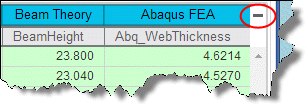
The table view displays your data set, where each row represents a data point (or an alternative) and each column represents a parameter, as shown in the following figure:
- The first, or header, row of the table contains the parameter names and, if the data include groups, the parameter group names.
- The small basket icon in the first column indicates data points that you are considering for a recommended alternative and have included in the basket.
- Symbols in the second column differentiate the source of the data. For example, Results Analytics displays different symbols to distinguish data that were predicted and data from different files that were combined. A legend mapping an icon to a data source appears with the Data Sources filters on the Explore page.
- Symbols indicate predicted data that were generated by an approximation.
- Filled symbols indicate Pareto optimal data points.

In the above example, the user has created objectives that try to minimize the AverageCostPerMile and maximize the Hwy MPG. In addition, the user set an upper threshold of 1000 for the Repairs. The table view indicates the following:
- All of the data were read from a single data source.
- Alternatives 23 and 21 are positioned along the Pareto front and are labeled as the best alternatives.
- The user is considering Alternatives 23 and 21 for final recommendation and placed them in the basket.
- Alternative 25 is ranked high, but the repair cost of over 1000 makes it infeasible.
Table View Operations
You can operate on the table view as follows:
- Expand the first header row to display the parameters in a group, if the data include groups. You must click on the icon on the top right of the Explore page to expand/compress the header row to display/hide groups.
- Click a parameter name in the header row to sort the table by the values of the selected parameter. Additional clicks change the sort order—ascending or descending. You can sort on multiple columns (up to a maximum of three). The sort priority is the same as the order in which you select the columns to sort by (higher priority is given to the most recently selected column).
- Drag a parameter name left or right to change the order in which the parameters appear in the table.
In addition, you can right-click on a row (or multiple selected rows) and do the following:
- View detailed information about the data point, as described below in More Information.
- Add or remove the data point from the basket.
- Exclude the data point.
- Add a data point to the table, or delete a data point from the table. If you add a new data point, you can enter the data for each parameter by hand or paste in data from, for example, a row of a Microsoft Excel® file.
- Add a parameter. The new column appears on the right end of the data table, and you can drag it to the desired position in the table.
Array Parameter Operations
If a parameter is an array, you can click on the  icon in the data table to see more information about the array. You can also plot array elements against each other or against the indices of the array. Results Analytics creates the same plot for the array parameter in each data point (each row of the table). You can include multiple array parameters in a single plot. If you place the data point in the basket, the plots of the array elements also appear on the Compare page.
In addition, if a parameter is an array, you can create a new parameter (a new column in the table) that is calculated from the elements in the array. The new parameter can be any of the following:
- Mean
- Median
- Mode
- Minimum
- Maximum
More Information
You can right click on the data table and select More Info to view detailed information about the selected data point. Results Analytics displays the following:
- Parameters: the value of each parameter.
- Files: files associated with the data point (typically images).
- Comments: comments associated with the data point.
- Likes: likes associated with the data point.
- Notes: notes associated with the data point.
- Array Plot: an XY plot of the values of an array parameter for the selected data point. You create the plot by dragging an array parameter to the axis of the XY plot. You can plot one array parameter against another, or you can plot an array parameter against the array indices. Results Analytics propagates the plots to all the data points and displays them on the Compare page.
An example of an array plot is shown in the following figure. The user dragged the Indices array to the x–axis and the Stress array to the y–axis.

In addition, you can do the following:
- You can edit the alias for the name of the data point and enter a more meaningful name that will help you identify an alternative, such as Customer Preferred Design.
- Add/remove the data point to/from the basket.
- Explicitly exclude the alternative from consideration.
- Upload a file that will be associated with the data point.
The More Info menu item is available when you select data points in the other data views.