Local Effects Plots
You view a local effects plots for each output parameter showing the relative influence of each input parameter (the inputs) on the predicted value of the output parameter. The local effects plot is valid only for the value of the output parameter indicated by the currently selected point on the prediction profiler.
Results Analytics creates the Local Effects plot by performing a Design of Experiments (DOE) study using the Latin Hypercube technique. The DOE creates 200 points sampled over a local region of the approximation (+/-10% of the total range centered around the currently selected point on the prediction profiler).
Results Analytics calculates the local effects by fitting a linear regression using the 200 points sampled by the DOE. The result of the regression () is a linear combination of the value of a parameter and its coefficient. The local effects plot is the value of the coefficient for each input parameter and indicates the relative effect of each parameter. A higher value of the coefficient indicates a higher effect on the predicted output. A bar to the right of the zero axis indicates a positive coefficient; a bar to the left of the zero axis indicates a negative coefficient.
Results Analytics updates the Local Effects graphs (a new DOE study and a new linear regression are executed) when you change the value of the currently selected point on the prediction profiler.
The figure below shows an example of a Local Effects graph. The input parameters are the dimensions of an I-beam, and the output parameter is the deflection of the tip of the beam under a fixed load. The graph displays all of the input parameters in order of their effect on the predicted value of the output parameter. Width4 has the greatest effect on the deflection, and increasing the width increases the deflection. In contrast, increasing the value of Width5 decreases the deflection.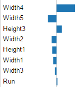
If you have more than one approximation selected, Results Analytics overlays the plots. For example, the figure below shows the local effects graph for approximations created with the two available techniques—RSM and RBF. The source of the approximation is indicated by the color of the bar, which matches the color in the Approximations legend.
