A Graphical View of Your Approximations | |||||||||
|
| ||||||||
An example of a portion of the Profiler view is shown in the following figure using data taken from an I-beam optimization problem. The input values, along the X-axis, are dimensions of the I-beam; the output variables, along the Y-axis, are a stress measure and the deflection of the tip of the beam. The red bar indicates the lower threshold for the width dimension. 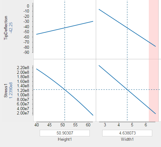
For each output parameter, Results Analytics displays the approximation curve for each input parameter. By default, Results Analytics selects the median value of each input parameter and displays the corresponding predicted value of the output parameter (the horizontal dotted line). You can change the value of an input parameter by dragging the vertical dotted line (between the lower and upper limits of its range) to view the effect on the predicted value of the output variable.
You can overlay approximation curves calculated by different approximation algorithms, using Ctrl + select to select multiple approximations. For example, the plot below from a composite beam analysis shows the approximation curves for the maximum deflection versus ply angle calculated by the Response Surface Model (dark blue) and the Radial Basis Function Model (light blue).
You can change the order of the output or input parameters by dragging a row or a column to a new position. In addition, you can delete a row or a column from the display by hovering over the row or column and by selecting the delete tool  that appears.
You can change the type of a parameter by dragging it between the Input, Output, and Unknown regions on the left of the page. (Unknown parameters are neither inputs or outputs and are not considered by the approximation.) After you change the type of a parameter, the approximation status is shown as out of date; you must regenerate the approximations by clicking Create New Approximations  from the toolbar at the bottom of the Predict page.