Adding the Alternative Created by an Approximation | ||||||||||
|
| |||||||||
When you are satisfied with the accuracy of your approximation, you can export the predicted alternative to your data set. For example, you may want to create a data point in an important region of your design space that was not included in the data generated by a design of experiments. When you add the predicted alternative to your data set, Results Analytics adds a line to the data table containing the current value of each input parameter and the resulting predicted value of each output parameter. If you want to consider the approximation as a potential recommended alternative, you can choose to add the predicted alternative to the basket at the same time you add it to the data table.
If you return to the Explore page, the approximation appears in the data table. A symbol in the table view of the Explore page indicates data that were generated by an approximation, as shown in the following figure (the predicted alternative lies on the Pareto front and was also added to the basket by the user):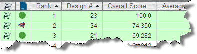
The new row contains empty values for parameters that were not marked as input or output and, consequently, played no role in the approximation. The new data point behaves like any other data point in your data set. For example, it appears in scatter plots and self-organizing maps.
Results Analytics scores your predicted alternative after generating the scores for the original data. As a result, the score for the generated alternative can be better than the best alternative (greater than 100.0) or worse than the worst alternative (less than 0.0).