A Quality View of Your Approximations | |||||||||
|
| ||||||||
For each output parameter, the Measure view displays a table of error measures such as the value. The table provides a quantitative measure of the accuracy or fit of the approximation.
The Measure view also displays a family of graphs that help you understand how well the predicted data matches the actual data. The icons in the Fit column indicate whether Results Analytics considers that the measure predicted a good fit (indicated by a green border around the icon) or a poor fit (indicated by a red border around the icon). You can hover over an icon to see the quantitative evaluation of the measure criterion; for example, when you hover of the Actual By Predicted icon, Results Analytics displays the values.
The following icons are displayed in the Fit column:
| Actual By Predicted | Residual By Predicted | Residual Percent Error | Cross Validation Percent Error |
|---|---|---|---|
 |  |  |  |
You can select points from the Actual By Predicted plot and/or the Residual By Predicted and use the right-click menu to exclude the points from the approximation. After you exclude points the approximation status is shown as out of date; you must regenerate the approximations by clicking Create New Approximations  from the toolbar at the bottom of the Predict page.
Excluding a point from a measure plot is the same as excluding a data point from a row of the data table on the Explore page and allows you to remove data points that are outliers and are exerting undue influence over the calculation of the approximations. You can select excluded points from the plots and use the right-click menu to reinclude the points when you recompute the approximation.
The criteria that Results Analytics uses to indicate a good fit are described below and are provided only as guidelines. You should review your data and the individual measure plots and decide if the prediction offers an acceptable fit.
Actual By Predicted
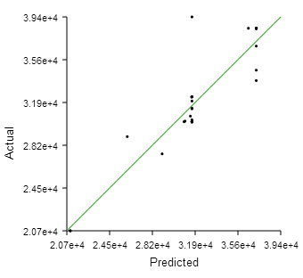
The Actual By Predicted plot is an XY plot of the actual value of the output parameter versus the value predicted by the polynomial regression analysis, as shown in the following figure:
The green line at a 45°
indicates a perfect fit (predicted value equals the actual value). When you hover over the Actual By Predicted icon, Results Analytics displays the results of the analysis. Results Analytics considers the approximation to be a good fit when all of the following conditions are satisfied:
- The value is greater than 0.80
- The adjusted value is greater than 0.80
- The root mean square value is greater than 0.005
Residual By Predicted
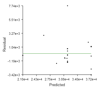
The Residual By Predicted plot is an XY plot of the residual value of the output parameter versus the value predicted by the regression analysis for each data point, as shown in the following figure:
The residual is the distance between the predicted value and the line indicating a perfect fit. The predicted value can lie above the line (a positive residual) or below the line (a negative residual). The green, horizontal line in the plot of residual versus predicted data indicates a zero residual—predicted value equals the actual value. When you hover over the Residual By Predicted icon, Results Analytics displays the ratio of the residual divided by the predicted value. Results Analytics considers the approximation to be a good fit when the ratio is less than 0.05.
You can use the Residual By Predicted plot to identify outliers (points significantly further from the green, zero residual line). You can remove outliers by selecting points from the graph and choosing to exclude them from the approximation or by excluding data points from the data set. (You can also exclude selected points using the Actual By Predicted plot.)
The Residual By Predicted plot also allows you to identify trends and patterns in the residuals. Ideally, the distribution of the residuals should be random, not increasing or decreasing or following a discernible shape with increasing predicted values.
Residual Percent Error
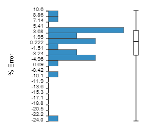
The Residual Percent Error plot is a bar chart showing the percent error (predicted value - actual value / actual value) as a frequency of occurrence, as shown in the following figure:
When you hover over the Residual Percent Error icon, Results Analytics displays the minimum, maximum, and mean percent error for the percent error and its standard deviation. Results Analytics considers the approximation to be a good fit when the standard deviation is less than 1.0. The vertical bar to the right of the bar chart shows the range of the upper and lower quartiles and the mean value.
You can use the Residual Percent Error plot to view the distribution of the residuals. For example, are more of the residuals close to zero or closer to the maximum residual, constant across the range of residuals, or is there a peak? Ideally, the plot will show a normal distribution centered around a value of zero percent error.
Cross Validation Percent Error
To cross-validate the approximation, Results Analytics randomly selects data points from the data set and divides the data set into 10 subsets of equal size. Results Analytics then removes each subset of data from the data set, recalculates the polynomial coefficients using the reduced data set, and calculates the cross-validation percent error by comparing the actual and predicted values of the output parameter at each point that was removed. Results Analytics repeats this procedure for each of the 10 subsets. This type of cross-validation is called "k-fold cross-validation"; the value of "k" is fixed at 10 and cannot be changed.
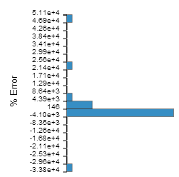
The Cross Validation Percent Error plot is a bar chart showing the percent error (predicted value − actual value / actual value) as a frequency of occurrence, as shown in the following figure: 
When you hover over the Cross Validation Percent Error icon, Results Analytics displays the minimum, maximum, and mean values for the percent error and its standard deviation. A standard deviation of less than 1.0 is considered a good fit. The vertical bar to the right of the bar chart shows the range of the upper and lower quartiles and the mean value.
You can use the Cross Validation Percent Error plot to determine the validity of your approximation for data points that do not appear in your data set (but still lie between the upper and lower boundaries). Ideally, the plot will show a normal distribution centered around a value of zero percent error. If the residual errors are small and the cross validation errors are large, you are predicting a data point that is not represented in the original data set, and you need to repeat the approximation with a larger data set.