Utility Plots | |||||||||
|
| ||||||||
The Utility plot, displayed to the right of the regression curves, is a measure of how close the combination of values of the input parameters results in the best fit possible to the objective parameter, as shown in the figure below: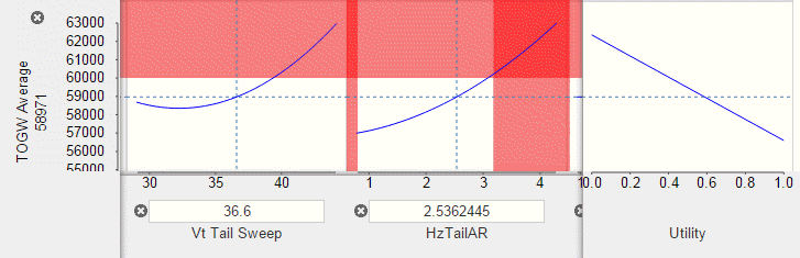
In the above example of an aircraft design optimization, the value of the utility varies between 0.0 and 1.0 with a negative linear slope, since you are trying to minimize the take-off gross weight (TOGW). For the selected values of the input parameters, the predicted value of the output parameter is given (the predicted take-off gross weight is 58971), and the utility value is approximately 0.6, which is an estimated score for the parameter for that predicted data point. The utility plot indicates how close you are to meeting the objective for that parameter.
You can experiment with changing the value of the input parameters (by dragging the vertical dotted lines) and viewing the effect on the output parameters and the utility plot. When you find a predicted design that maximizes your utility across multiple parameters, you can add the predicted alternative to your data set by clicking Add Predicted Design  from the toolbar at the bottom of the Predict page. Changing the value of the input parameters does not change the measure of fit. You must add or exclude data points to improve the accuracy of your approximations.