FeatureChooser | |||||
|
| ||||
Layout Design
A feature chooser enables you to select objects inside a proposed list.
Knowledge Items
| Items | Explanation |
|---|---|
| Visibility | Widget display. |
| Sensitivity | Activation of the widget ( react to user interactions or not). |
| ChosenItems | List of selected items. Dynamically add or remove elements with the language changes the selection. |
| SelectedIndices | List of indexes of the selected items. Dynamically adding or removing indices with EKL changes the selection. |
| ProposedItems | List of items to display. Dynamically adding or removing items with EKL changes the content of the list. |
| TypeRestriction | String that displays only the elements of a given type. |
| Height | Height of the widget in pixels. |
| Width | Width of the widget in pixels. |
| PresentedAttributes | Names of attributes to display in columns separated by commas. Example to display the name and color : Name, Color. |
- Renaming Columns
- If you want to rename one or more columns, add a CATNls file with
the feature chooser name to the resource container of the
know-how apps component. The new column names must
be entered as follows:
Original_Name="New_Name". The original names
are those you can find in the
Presented Attributes
attribute (separated by commas) of the Feature
Chooser. Use
Import Files
 to add this file to the component. In the example below,
the CATNls file name is FeatureChooser1.CATNls.
to add this file to the component. In the example below,
the CATNls file name is FeatureChooser1.CATNls.

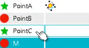
- Adding an Icon
-
To add an icon, enter an icon name in the columnName_Icon attribute. In the example below, the first feature of the chooser is the icon named MyOwnIcon.
set f= NewFeatureChooser\ChosenItems[1]
f.SetAttributeString("Name_Icon","MyOwnIcon"
You can add icons dynamically on selection events and have the icons changed when you click the features. To do so, create a VolatileInstance and add attributes for the icon.