What's New

This section describes recent changes in Data Perspective Studio.

This page discusses:

R2022x FD01 (FP.2205)

Export Table Values as CSV to 3DDrive

In the Table visualization and the Data panel (showing Underlying data), you now have an option to export values as CSV to 3DDrive.
Benefits: You can export what you currently see in the table.
For more information, see Export CSV to 3DDrive

Show Images Stored on the DFS Object Storage service of the 3DEXPERIENCE platform

In the Result List, Hit Details, and Image visualizations, you can now reference an image stored on the DFS Object Storage service of the 3DEXPERIENCE platform.
Benefits: You can use images ingested by Data Factory Studio, and stored on the DFS Object Storage.
For more information, see Show Images in Hit Results

Drill-Down and Drill-Up on Chart Dimensions

In the basic (Line, Spline, Scatter, Area, Bar, and Column), Pie, Donut, Heatmap, and Bubble charts, you can now allow users to switch from one dimension to another.
Benefits: You can use this feature to switch between dimensions and reveal more details on your chart.
For more information, see Drill-Down and Drill-Up on Dimensions

Targets in Multi-KPI Visualization

In the Multi KPI visualization, you can now define targets with conditions.
Benefits: When the KPI value matches a specific target condition, you can highlight it, and show menu actions specific to reached targets.
For more information, see Add a Target

Conditional Display of Canvas Component in Tabs Visualization

In Tabs visualizations, you can now specify a condition to hide or show a canvas component.
Benefits: You can use this feature to reveal critical values.
For more information, see Add a Condition to Show the Canvas within a Tab

Polar Chart Visualization

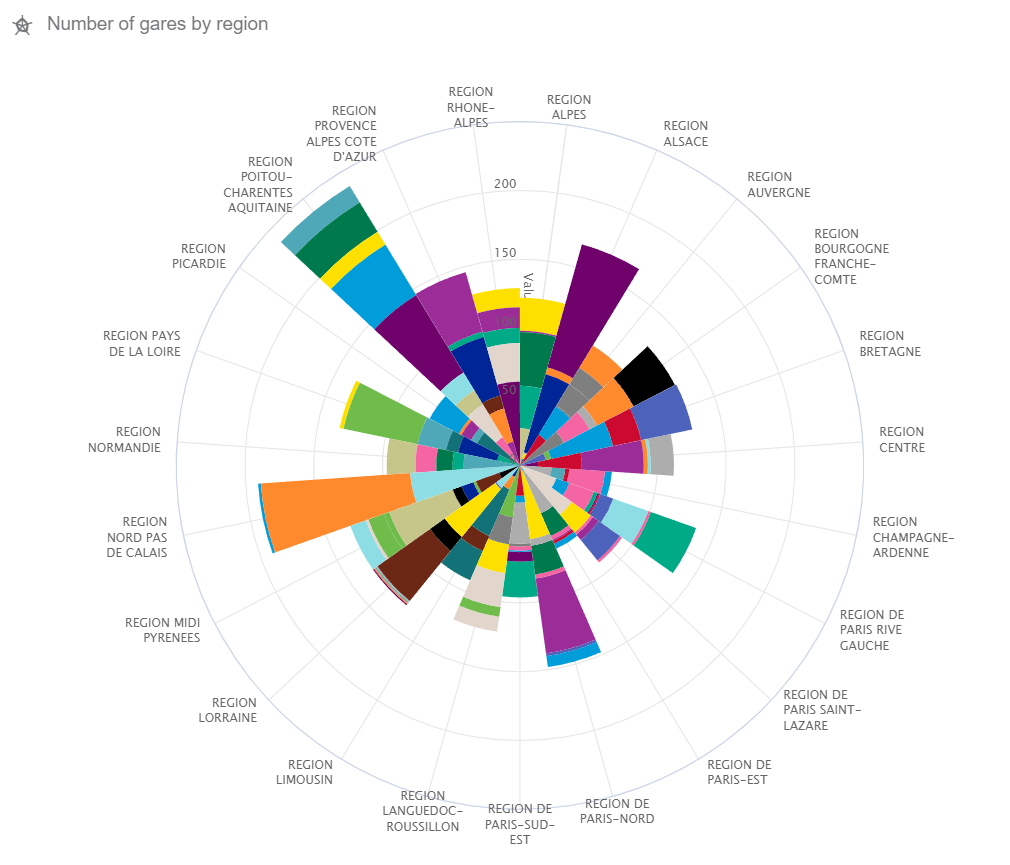
Polar charts, also know as radar charts, show different series types on a radial axis.
Benefits: It is useful to compare values with the X axis wrapped around the perimeter, and measures in bars or lines.
For more information, see Polar Chart

Word Cloud Visualization

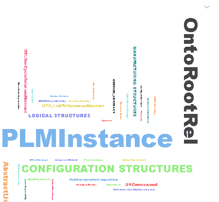
Word Cloud visualizations show a set of words, where the weights of words determine their size and position.
Benefits: It is useful to visualize how often each word in a text occurs. Words that appear often appear larger.
For more information, see Word Cloud

R2022x GA

Add a Sidebar Menu to your App

The Menus menu allows you to define sidebar navigation menus, that you can then insert in your app screens.
Benefits: Data Perspective Studio centralizes menus at the app level so that you can use it as a common menu in every app screen.
For more information, see Adding Sidebar Menus

History Timeline Visualization

This visualization shows a timeline of event or changes for a specific hit.
Benefits: This can be useful to show the history of modifications made on an object in a chronological order.
For more information, see History Timeline

History Breadcrumb Visualization

This visualization allows you to keep track of visited pages, and come back to a specific page in one click.
Benefits: You can enhance the app navigation with this visualization.
For more information, see History Breadcrumb

Graph View Visualization

You can use this visualization to show objects with their linked objects. Data Viewers can right-click linked objects to expand them.
Benefits: This exploration view can be useful to show objects and their relationships.
For more information, see Graph View

Interact with Top Bar Search

You can link a Data Query to a Search In Current Tab performed within the 3DEXPERIENCE platform top bar.
Benefits: When the Data Viewer performs a search from the top bar, Data Perspective can either open a dedicated screen to show search results, or update the current screen to show filtered results.
For more information, see Interacting with Top Bar Search

Apply Local Filters on Visualizations

You can define local (internal) filters to focus on specific dimension values in a visualization. The Local filter option is now available for several visualizations, like Simple KPI, Waterfall, KPI table, History Timeline.
Benefits: This feature is convenient when the source dimension scope is too important, and you need to show a few specific values only.
For more information, see Reduce the Scope of Dimensions with Local Filters

Export Visualization

Data Viewers can now export a .png snapshot of a selected visualization.
Benefits: This feature is convenient to share a view of an important event that occurred in your data set to your coworkers.
For more information, see Export a Visualization

Drag a Visualization from the List to the Canvas

You can now add a visualization on the screen canvas by dragging it from the visualization list.
Benefits: This feature is convenient to drag a visualization anywhere on the canvas. When you add a visualization by clicking it from the list, Data Perspective Studio positions it as the first visualization of a new line at the left of the screen layout.
For more information, see Add Visualizations to a Screen

Duplicate a Screen

You can duplicate existing screens inside the same app.
Benefits: This feature is convenient in your app design, to duplicate a screen configuration, and edit the copy to change the elements requiring a specific configuration.
For more information, see Duplicate a Screen