Interpreting Your Self-Organizing Maps | ||||||
|
| |||||
Results Analytics displays the self-organizing map as a two-dimensional hexagonal grid, where each hexagon corresponds to a bin. The color of the bin indicates a value—the data points in the bin are the closest points to the value of the bin. When you hover over a bin of the self-organizing map, Results Analytics displays the weight value it assigned to the bin for the particular parameter.
Some bins contain a circle whose radius indicates the number of points in the bin. A bin without a circle contains no data points (the bin still has a value, but none of the data points are close to that value). The position of the points within the bins is fixed across all the self-organizing maps for your data set. As a result, for a family of maps showing different parameters, the circles, or lack of, inside a bin remain the same; only the coloring of the cell changes, to reflect the value of the bin for a particular parameter.
Green circles indicate Pareto Optimal alternatives that lie along the Pareto front. For more information, see Data Points Feasibility.
To help you identify clusters in your self-organizing maps, Results Analytics displays a
Unified-Distance
Matrix
map for your data set. The bins are colored with a grayscale ranging between dark gray and
white. White or lighter regions reflect bins whose weights are similar to the weights of their
neighbors and indicate clusters. Conversely, darker regions indicate lack of clustering;
darker regions form boundaries between clusters. The following unified-distance matrix map
shows clusters of bins with similar weights:
A self-organizing map of an objective parameter uses different shades of green to indicate
the parameter value. The same shading appears in the
Parameters
legend. A darker shade indicates a "better" value—a low value if the objective is trying to
minimize the parameter value, a high value if the objective is trying to maximize the
parameter value, and a value closest to the target if the objective is trying to target the
parameter value. Infeasible regions of the design space are represented by hexagons shaded in
dark colors. The following figure shows two dark green regions that were also identified on
the unified-distance matrix map: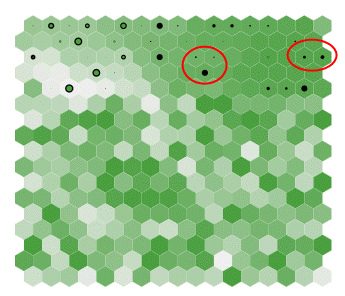
Results Analytics displays a parallel coordinate plot below the self-organizing maps, as shown in the
following figure: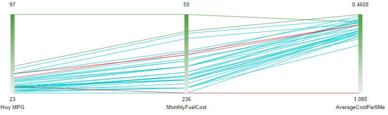
The
vertical axis represents a parameter, and each line connecting the axes represents a data
point. The color of the line indicates its feasibility (in the example, the two best
alternatives appear as green lines, and the infeasible alternatives appear as red
lines).
The color coding of a vertical axis serves as a legend for the colors in the self-organizing
map. If the objective is to maximize the value of a parameter, the white end of the scale
represents the lowest value of the parameter and the dark green end of the scale represents
the highest value. The reverse is true when the objective is to minimize the value of a
parameter. In the example shown in the above figure, the user has chosen to maximize the
Hwy
MPG and to minimize the
MonthlyFuelCost and the AverageCostPerMile.
- Select bins from the self-organizing maps; the parallel coordinate plot displays only the data points in the selected bins.
- Move the limit arrows in the parameter histogram, and filter out the resulting infeasible data points.
You can click Map View Parameter
 and select
the parameters to display in your self-organizing maps. If you select a parameter that is not
an objective, Results Analytics always scales the vertical axis of the parallel coordinate plot from the lowest value of
the parameter at the bottom to the highest value at the top.
and select
the parameters to display in your self-organizing maps. If you select a parameter that is not
an objective, Results Analytics always scales the vertical axis of the parallel coordinate plot from the lowest value of
the parameter at the bottom to the highest value at the top.
The self-organizing maps and the parallel coordinate point are linked together. For example, when you click on a bin of the self-organizing map, the parallel coordinate plot shows lines for only the data points present in that bin. Conversely, if you click on (or hover over) a line of the parallel coordinate plot, Results Analytics highlights the corresponding bin of the self-organizing map and shows the value of each parameter on the vertical axes of the parallel coordinate plot.
You can add/remove data points from the basket or exclude/include data points from scoring and ranking by doing the following:
- Right-click on a bin in the self-organizing map (Results Analytics selects all of the data points in the bin)
- Right-click on a line in the parallel coordinate plot